Wireless Usability etc
William Hudson of Syntagm and CHI-WEB makes good points in Crossing the Wireless Chasm about the wireless industry ignoring usability. My favorite bit: "WAP (Wireless Access Protocol or What A Palaver)" —emphasis and definition link mine.
Other tasty reads on the Syntagm site include: Welcome to Nirvana: Naïve Beliefs of Usability ("Many web sites would rather force users to click ten times with the mouse than to allow them to type in a simple date - and usually in the middle of a series of alphanumeric fields.") and one in which I have a personal interest: Navigate on the right? The jury is still out.
He also has a nice Usability 101 page, with a very British-sounding computer saying "Shan't." in a dialog box. It includes the Jakob Nielsen five dimensions of usability: Learnability, Efficiency, Memorability, Errors, and Satisfaction. (from Usability Engineering, one of the first books I read, although my favorite book so far on the practical side of usability testing is Jeffrey Rubin's Handbook of Usability Testing, particularly the need to be zen during usability tests (more specfically, a detached observer).
Posted by Chad Lundgren on Thursday, December 26, 2002 (Link)
(See entry on its own, including comments)
I'm afraid I can't do that, Dave
I was looking around at screen reader products to get a feel for what they are like.
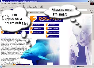 I made the mistake of downloading Hal™ from Dolphin Software (the lady holding glasses is such a generic stock image I recognized it without my contacts in. The blue link on top of the blue dolphin is nice.)
Did I learn nothing from 2001? The name should have warned me off, but I waded right into the artificial stupidity.
First off, the Hal™ software has a 30 minute demo period. Not 30 days, 30 minutes. Apparently this is about the same as JAWS, the leader in the field.
So I tried to change the settings and the best I could get is 1024x768 with 16 bit colors. I shrugged, uninstalled all three packages the HAL demo install, and rebooted.
The 16 bit setting was still the best I could get! You understand I've been doing 32 bit for a month now (with 64 Meg card my brother, a bleeding-edge gamer, no longer found adequate.)
For those of you wondering what bits are, I have a custom background with lots of swirling Jovian clouds. 16 bit color makes it look grainy and nasty. 24 or 32 bit means nice and smooth full color mode.
Every time I tried to use any 32 bit mode, it snaps back to 640x480, at 256 colors no less. Unbelievable! Finally, I re-installed my video drivers and that solved the problem.
Talk about anti-social software! There is an expression among hikers and cavers: Leave it as you found it. This is what an uninstall must do.
Posted by Chad Lundgren on Saturday, December 21, 2002 (Link)
(See entry on its own, including comments)
The Usability of Movable Type
Preface: I have registered Movable Type at the $45 level.
Here are my usability notes on Movable Type. Some or all of this will not make sense to people who don't use movable type. So don't get all learned helplessness on me, look it up or don't read it. :-)
1. When you're editing a template , you have two buttons. Save, and Rebuild. Save does what you'd expect, which is to save the entry into the database. But Rebuild does just that: rebuild. It does NOT save the changes you just made. You have to hit Save and THEN Rebuild. Why not make Rebuild have an implicit Save of whatever changes made on the current screen?
2. Speaking of Rebuild button at the bottom: why not call it "Rebuild just this entry"? It took me some time to realize the rebuild button at the bottom rebuilds just that template or entry, which is faster. Why hide this cool functionality behind a name that is not specific enough.
3. Why doesn't clicking in the image upload field pick the radio button? A graphic:
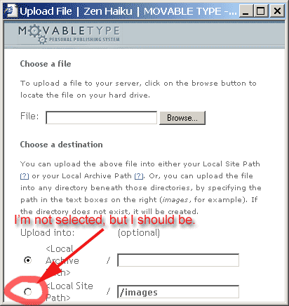
Granted, I'm odd because I fill in the path before I pick the file name, but I don't think that affects the point.
4. Installs and upgrades are gratuitously hard, mainly because directories are not in the right place, not even to match the default set up. Things that need to end up in the static directory are not there when you uncompress it. Even granting that Movable Type is not trying to complete with blogger, it's still not as easy as it could be. Make the defaults to where everything works, and does not require mass moving of files.
5. Better defaults: Why not make title-based filenames the default style for individual entry archives? In other words, the default looks like: /archives/000053.html, instead of /archives/like_my_life_is_so_like_boring.html.
It took me a lot of googling to get the right format: annoyingly enough, this feature is mentioned prominently, but I could not find how to actually do it from the Movable Type site itself.
Speaking of which, here is the gory details of how, it's actually relatively simple:
Once you're in your blog, click into Blog Config, and select the Archiving section. Then, in the empty text box next to "Individual Entry Archive" paste this code:
<$MTEntryTitle dirify="1" $>.html
"dirify" means change files names from "Like%20whatever.html" to "like_whatever.html" Good functionality, wrong default. Why do you need to add the dirify tag at all? Why would you ever want nasty filenames with spaces in them?
7. The date is set once, when you first create a post. It is not automatically updated as you work on it. I often edit my posts over days rather than hours. I don't require my posts to be completely polished, but I like them a bit shiny. So the posting dated December 11th was indeed started on December 11th, but was not posted on the 11th as you might expect, but only a few days before this post (where I have updated the date).
And, to end on a positive note, good points:
1. Use of accessible templates starting with version 2.5. Accessibility is not usability, but it goes together well.
2. XHTML/CSS setup from the get-go.
3. The cost.
4. The ability to easily donate via PayPal, but no high pressure tactics, just a nice request.
5. The automatic re-building of archives, frees you to focus on the content.
6. With newer version of Movable Type, TrackBack auto-pinging. This means that you don't have to remember to do TrackBacking: it attempts to ping a site automatically. Trackbacking itself is a cool idea that I feel could have been explained better in the beginning.
Some of the changes I'm suggesting are Javascript, so I may well write them and post for people to use.
Posted by Chad Lundgren on Wednesday, December 18, 2002 (Link)
This posting came out dated as December 16th the first time I posted it. Another data point for the need to update the date point.
(See entry on its own, including comments)
AOL wins spam lawsuit over 1 billion spam emails
There are certain vermin for whom the legal system can be appropriately nasty. This is based on a Virginia anti-spam law.
AOL Wins $7 Million From Spammers (via Google News)
Update: 06/25/03. I had to delete all the comments to this entry and turn off comments because a big nasty batch of blog spam was being added. Giventhat I put recent comments on the home page, this is even worse than it might be otherwise. I deleted all the comments becasue in retrospect the first comment, which I was already suspicious of, was only the first of many spam.
Ironically enough, it was spam for something that claimed to stop popup windows. Get Mozilla, or better yet, Firebird, and you'll have that built in!
Posted by Chad Lundgren on Monday, December 16, 2002 (Link)
(See entry on its own, including comments)
Eyeblaster Ads & Message Service Spam
Have you seen these ads that zoom all over your web browser? And slow computers freeze while this excrescence of capitalism-gone-mad is loaded.
I invented the term "insult ads" when I noticed one featuring insult comedian Don Rickles schilling for Las Vegas. Well, the self-damning name is eyeblasters. (Update: 04/18/2003. Link changed to ad gallery link. Warning: Will STILL eyeblast you.) The moniker "Eyeblaster" is appropriate for ads that behave like a hyperactive three year old hopped up on powdered sugar.
Highlights from a spec sheet of these crimes against decency:
(Updated 03/25/2003: The original spec sheet is gone, replaced by a spec sheet that features "istreams", or streaming video that is automatically played. But the original is worth quoting, so here you go: )
"Frequency Cap: One per 20-minute user session." —
They'll only be a water drop on your face every twenty minutes, how can you call that torture?
"Audio: Yes (can be host-initiated)" —
Can be host-initiated? You mean the ad can be set to be polite and let people turn the sound off, but the default is to assault them with it. If there's a good executive summary for usability, it's "making computers polite and helpful."
"Move Duration: 15 seconds".—
Excuse me? You admit you're hijacking the browser for 15 seconds, not counting download time?
Even more cutting edge in user-savage marketing evils is "Windows Message Service" spam-vertising. This uses a built-in Windows service to send popups without you even havnig a browser open. All you need is an Internet connection. I received a message like this yesterday, despite having ZoneAlarm on.
Guess what it was for? A service that will turn your Window Message Service off for you. They want you to pay them to go away. That's a hell of a business model.
I Googled to this helpful page about Windows Message Service Spam and how to turn it off, which I did.
Why does this anger me? It's like a public campground. It only takes a few hormone-drunk adolescents and some spray paint to pollute the whole place and make it seedy.
These make-money-fast, con artists don't care if they firehose the Internet with the white noise of spam so long as they make money. And spam is ever-growing, seeking new channels and increasing the amount in old channels. If information is viewed as a biological system, spam is cancer.
Turning to more traditional email spam, some enterprising folks have organized a junk mail campaign—using actual physical letters—against one of the most offensive spammers .
How else to fight back? I would love for an epileptic to sue the flashing ad banner people. People with extreme sensitivity to sudden sound bursts (like some autistic children) would be ideal candidates for lawsuits about automatically playing sound. Lawsuits will get these squalid, money-grubbers' attention like nothing else.
Posted by Chad Lundgren on Wednesday, December 11, 2002 (Link)
(See entry on its own, including comments)
Chad Lundgren, Userati
Chris McEvoy of the mildly-worded Usability Must Die site has put together a interesting userati list on his other site, Usability Views, using Google as his arbiter. Unless I'm mistaken, he's un-Heisenberged it and removed the userati page itself from consideration in the userati score.
Yours truly ranks a lofty 165. The top userati Jakob Nielsen has 11,420. Christina Wodtke of Elegant Hack has 1,673 and John (S.) Rhodes of WebWord 1,548. (As of December 9th, 2002).
I had fun looking through the list and discovering people whose work I have been using, but was vague or blank on who they are. Stuart Card invented the useful GOMS ( Goals, Operators, Method, and Selection Rules) system.
The GOMS executive summary : it's a way of calculating the average time a user takes with an interface to actually DO something like convert Celsius to Fahrenheit or buy collectibles they don't need on Ebay. I've run interfaces through GOMS and been suitably horrified. Sites that let you type years into a form instead of using an enormous dropdown menu may have designers who read Stuart Card.
Ben Shneiderman's Leonardo's Laptop sounds very interesting: what if Leonardo da Vinci had a laptop: what would he demand of it?
There's other userati I'm checking out, and others I already have. I hope userati becomes an accepted coinage: userati has a nice next-to-the-last-syllable lilt.
Posted by Chad Lundgren on Sunday, December 8, 2002 (Link)
(See entry on its own, including comments)
Zenahaiku? zenhiaku? usability
It's a good thing people link to me, because "zenhaiku"
is fairly easy to mistype as either "zenahaiku" or "zenhiaku". The latter is especially popular with the dyslexic set.
In case it's not obvious, I'm mocking myself.
(While I'm at it, I'm looking into adding user settings for the password previewing tool as Christina Wodtke mentioned wanting.)
Posted by Chad Lundgren on Friday, December 6, 2002 (Link)
(See entry on its own, including comments)
Movable type tweaks
Iindividual entry archives are now using names. All the old numeric names still work, but I wouldn't mind if people changed their links to the new version. (Just clicking on the old link will show the new URL since I have set up redirects.)
I'm also working on making the site more accessible. As far as I can tell, having the content on the right side means I don't need any of the skip navigation business that sites with left side navigation need. I've modified the search form to use labels and fieldsets. The fact that the search form now looks better is just instant karma in my opinion.
Posted by Chad Lundgren on Friday, December 6, 2002 (Link)
(See entry on its own, including comments)
Most Popular
- Seattle Sunset background image
- Usability applied to life
- Is "My Bad" Bad?
- Free Password Previewing Tool version 2.3 (146 Kb)
- Sunset in New Mexico background picture
- Bath and Body Works
- Atkins.com: Lose the Table Fat
General
Other Web Logs
Categories
- Adminstrative: 11 entries
- General: 51 entries
- Personal: 2 entries
- Photography: 13 entries
- Poetry: 8 entries
- Usability: 71 entries
Archives
- October 2006
- February 2006
- July 2005
- June 2005
- March 2005
- December 2004
- September 2004
- August 2004
- July 2004
- June 2004
- May 2004
- March 2004
- February 2004
- January 2004
- December 2003
- November 2003
- October 2003
- September 2003
- August 2003
- July 2003
- June 2003
- May 2003
- April 2003
- March 2003
- February 2003
- January 2003
- December 2002
- November 2002
- October 2002
- September 2002
- August 2002
- July 2002
- June 2002
- May 2002

Unless otherwise expressly stated, all work on this site including photos, poems, and web logs entries are licensed under a Creative Commons License.