Street Jogs and Kitty Corners
Donna Maurer, a fellow usability blogger in Australia, had an interesting comment on Going Postal Mapping. She liked my post but wanted to know what "jogging street" and "kitty-corner" meant. I hadn't realized these were Americanisms.
Jogging streets are streets with sections that do not intersect normally. While travelling along a street, you run into a street, turn right, go a short distance on another street, then turn left back on that first street, which still uses the same name and numbering.
Kitty (or Catty) Corner means diagonal, but is more informal; I often hear it when people describe houses in their neighborhood: My best friend's house was kitty corner from mine.
So I looked for examples of jogging streets, and discovered civil engineers call the actual intersection involved "street jogs", and ran across the Yavapai County standards for residential street jogs [Link removed 09/18/03 - no equivalent page seems to exist now. -- Chad Lundgren.] This page is a bit slow, but has good examples.
Civil engineers do not believe in my rock-chucking test, because the definitions specified minimum, not maximum distance for street jogs. Perhaps street jogs with the sideways travel distance smaller than 125 feet (38 meters) or 150 feet (46 meters) are thought to cause more accidents.
So those standards would probably disallow the Jefferson Street jog that inspired the rock-chucking rule outlined in Going Postal Mapping. It qualifies, as a thought experiment: I didn't actually chuck a rock. According to a friend, many roads in that neighborhood jog since the subdivision was laid out wrong. The section right next to Central, put in later, had to jog. Nothing like sloppy work cast in concrete.
To get back to the broader issue, it's easy to glibly say, I can write international style, I just won't use baseball metaphors. The reality, as usual, is more complicated.
Posted by Chad Lundgren on Tuesday, July 30, 2002 (Link)
(See entry on its own, including comments)
Going Postal Mapping
I moved recently and wanted to look up my local post office's phone number. I ended up at the Post Office Locator. In the midst of struggling, I received this mysterious message:
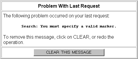
Even after clicking the "Clear This Message" button, I received the same message. The unhelpful help wrongly calls the button "CLEAR". I didn't see a home link for starting over. I had smack my Back button repeatedly to start over. I still don't know what the message meant.
The struggle was to find a particular post office on Juan Tabo. Juan Tabo (Spanish for "John Tabo") is a soulless, six-lane, major north-south, too busy for median-landscaping bastard of a street. Should be easy to find, right? Punching in my zip code, I picked a map link:
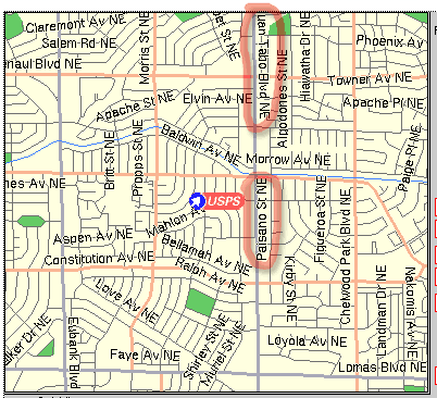
First, the "X marks the spot" icon with the word "USPS" on it sucks. From what I can tell, the address is on the second S in "USPS", NOT on the blue and white arrow. Sometimes.
Second, the words "Juan Tabo" are at the top, and the crucial "J" is cut off (circled in red). Third, too many side streets clutter the map. Fourth, and most damning: a tiny street named Paisano runs parallel to Juan Tabo; where its label sits, it makes Juan Tabo look like Paisano. (circled in red too).
On top of it all, the street name listed was Haines. Now, the only Haines I knew of was 4 miles west, so it was clearly wrong. But the post office is technically on Haines, because Haines jogs. I hate jogging streets, since before I'd even heard of usability or the web. So I'll finish with Chad's Jogging Streets Rule:
Stand on one corner of this alleged street, chuck a rock at the kitty-corner of the other section of this alleged same street. If you can hit it that corner, it is the same street. If not, it is a different street and should have a different name!
Posted by Chad Lundgren on Monday, July 29, 2002 (Link)
(See entry on its own, including comments)
Touching News
More proof America's Puritan-derived touch-phobia is unhealthy:
"...Human skin has a special network of nerves that stimulate a pleasurable response to stroking...a second slow-conducting nerve network of unmyelinated fibres, called C-tactile (CT)...." New Scientist
"...Slow fibers function from the earliest hours of life, perhaps even in the womb, while the fast fibers develop slowly after birth." The Washington Post
Posted by Chad Lundgren on Monday, July 29, 2002 (Link)
(See entry on its own, including comments)
Usability principles applied to programming
Usability principles I apply to programming/design:
I use the most restrictive naming conventions for everything. Essentially no characters besides letters, with case mattering. A lot of InterCapping.
Use of different variable names. I know all about scope, but I change the variable names for my benefit, not the computer's. Nested for loops using j, for instance.
I've read both CSS specs, but not recently. I don't want to waste my time on CSS vaporware: features in the spec, but that no one, not even Mozilla, implements. I generally avoid using the specs to look things up, because other sources tell you how to use it, and even more importantly, which browsers it will work in, something the W3C people don't want to sully their standard hands with.
I try to make my industrial strength passwords also relatively easy to type. I've failed more often than I've succeeded, but one thing I've learned is that capital letters in the middle of words are a sure-fire recipe (at least for me) for frustration, maybe because my brain is used to watching for two letters getting SHifted at the beginning of words but not in the middle.
Posted by Chad Lundgren on Friday, July 26, 2002 (Link)
(See entry on its own, including comments)
Untitled poem
Ah, the lies her hands told,
Whispering down silken traces.
Tangled muscle knots flowed,
Unraveled by haptic graces.
Goddess touching me real—
But only in my touch-struck eyes.
So I must ignore feel,
And hands-on apostasize*.
*The way I've always said and spelled apostatize.
Posted by Chad Lundgren on Friday, July 26, 2002 (Link)
(See entry on its own, including comments)
Usability for Programmers
There's this idea floating around that programmers, web developers, shouldn't need usability. They should be smart enough just figure it out. While it is true that programmers need to be to handle a high degree of complexity and arbitrariness, things are harder than they need to be. Regardless of any inherent complexity, well-designed tools make it easier to do the right thing than the wrong thing.
Here are some my pet peeves I've run across in my years as a Web Designer/Developer. Most will make no sense to non-technical folks:
Why is it "User-agent and not "User-Agent" for the robots.txt standard? How standard is that?
Why is it "padding-left:" in CSS and not "left-padding:"? Are we French all of sudden, putting adjectives after nouns? Why does order matter so much in shorthand shortcuts? Why is url required in @import url("/styleesheet.css"); (but not in @import "stylesheet.css"; for maximum confusion. What the hell else would I be importing, wine and cheese from the French Riviera?
Why does HTML use angle brackets? < and > are a pain to type. Square brackets would be much easier. [see?] Don't talk to me about SGML or character frequency.
Why are programming languages still being used that allow buffer overflows? This problem was solved 40 years ago. [Link to Phil Agre comment updated 03/25/2004] . All those Outlook viruses are the result.
Why are compiler/Javascript error messages so wretched? Netscape, both 4 and 6, have more specific, useful Javascript error messages than Internet Explorer, any version. This is probably the only time you'll hear me say something nice about Netscape 4.
Why doesn't command line cvs remove files for you when you issue a remove command? Talk about lazy. I've starting using WinCVS for some projects, and it does this for you. cvs in general is irritating: it has a habit of scrambling your terminal when you hit Control-C to stop an operation, forcing you to type "stty sane" or "reset" without anything being echoed.
Why aren't there standard comment characters across languages? Some programing languages use the same characters other language use for comments to actually do stuff. #, anyone?
The find command is powerful, but has odd syntax, even for a UNIX command. What genius picked a semi-colon as the terminator, so you have to backslash it? Didn't they notice it was already separating commands? I like UNIX, use it to slice and dice web server logs, but there are gratuitious complications.
I'm not optimistic about change. I am not innocent of using gratutiously complicated methods myself. Just today, a colleage wanted an image off a page that has a 0 second meta refresh tag on it. I telneted in directly to port 80, read the HTML, and contructed a path in my browser and emailed the picture off to him, showing off my ability to use raw HTTP/1.1. Then I realized the same thing could have been accomplished simply by using Internet Explorer's Ignore meta refresh tags setting.
To end on a positive note, progress is possible. The FTP default used to be ASCII and not binary. On the version of Linux I looked at, a recentish Red Hat version, it had been switched to binary.
Any other examples, good or bad?
Posted by Chad Lundgren on Friday, July 26, 2002 (Link)
(See entry on its own, including comments)
Paying (or not!) at the Pump
About 20 after midnight last Saturday, I needed gas. A lot of gas stations were dark, obviously closed. I passed two like that.
I found one with lights on, and pulled up to a pump. Its display was blank—not dark—blank. I looked at the next pump—blank too. Are they closed? Are the lights on for security? I wondered as I drove off.
Next station. The display said, One moment please. This message looked like the usual "I'm checking up on your credit card, you dog" message. Hoping it was stuck from a prior transaction, I beat the Cancel key, to no effect. I slid the card in and it talked about maintenance. Gee, thanks for that clear message there.
Third station. I hopped out, glaring at the display. It looked normal. I put my card in, backward, I realized as I did so. (Mini-rant: why in hell can't they standardize the insertion orientation?) The pump told me it was the wrong way: I re-inserted. It thought for a time, and only then, it said, Pay at the pump is not available, please pay inside.
I swore, marched in and left my credit card at the counter. As I pumped the gas, I said to a friend in the car, they're rebooting the damn computer for the accounting department. Sure enough, as I finished, the display read "Loading |". The dervish didn't even whirl, the | just sat there. (For those you wondering what I'm talking about, a whirling dervish is the old-school text version of an hourglass windows wait cursor).
How hard is this to get right? Just display the actual status when I walk up, or leave the damn lights off. Don't waste my time.
Posted by Chad Lundgren on Monday, July 22, 2002 (Link)
(See entry on its own, including comments)
Positive Usability
Usability types are often accused, with some justification, of focusing on the negative. It's easier to notice the lack of usability more often than the presence. Good usability is like a waiter that's only there when needed.
Some examples of good or improving usability:
I noticed a crew working on a curb near my work making it a more natural angle for people turning left. See the Usability of curbs posting for the original rant.
The manual for my Toyota had a complicated diagram for the situations under which you could shift to what gears (it's an automatic). I don't have to worry about it they did it right. It offers constraints that keep me from doing something stupid.
While I'm on cars, why do all those science fiction movies have cars with joysticks? The wheel is clearly the right solution.
Stephen Gass invented a saw brake. It stops the blade on power saws very rapidly if it stops cutting wood, causing only a slight cut rather than the alternative. This is what us usability types like to call constraints. It means not letting people do something they really don't want to.
I'm seeing more sites putting the cursor in the search field for you, a la Google, or the username field, because that's where you want to be. Yahoo mail, for instance, whatever else its flaws, does this right.
Between Photoshop 5 and Photoshop 6, the usability noticeably improved. Editing text on the canvas, showing selections when you change them even if they are hidden, putting the tool options in one place, these are all good things.
Posted by Chad Lundgren on Friday, July 19, 2002 (Link)
(See entry on its own, including comments)
2 Poems
I've noticed many poems are verbal calisthenics for the reader, almost the opposite of usability. This is good. Here's one I wrote:
Entropic whirlwinds
Helicopter around you,
Swirling your dreadlocked hair.
You dance with night
And I am afraid.
I'v finished a poem using a form called the villanelle [Link updated 03/12/2004] which I will post when I reconnect my computer at home, having just moved. Dylan Thomas's "Do Not Gentle into That Good Night" is the most famous example of a villanelle. I decided moving to rhyming for most poems wasn't enough, I wanted to use actual poetic forms. It turns out this makes a poem take exponentially longer to write.
I find it interesting how exposed posting poetry makes me feel, as opposed to all the other posts. Here's another one:
Tone deaf to the music of touch,
Color blind to the hues of speech.
Redolent of the copper clutch
Of the modem's shuddery screech.
The first line dropped into my head in the middle of a conversation. The other three took longer. I've never had a whole poem show up: 2 lines is the longest.
As always, comments welcome.
Posted by Chad Lundgren on Thursday, July 18, 2002 (Link)
(See entry on its own, including comments)
Small is not beautiful on the web
Why do web sites make their text tiny? Even worse, they make it tiny with stylesheets so that the View, Text Size option in Internet Explorer doesn't work. Sites like k10k and praystation specialize in tiny text, and seduce web designers down the "small is beautiful" path to perdition. Jeffrey Zeldman influentially advocated using pixels to specify text size, because pixels are easier. He's right. It is easier: for the web designer.
What about the user? The one with bad eyesight, who doesn't know you can increase the font size in windows? I can read these tiny fonts, but I don't enjoy it. I don't like fine print on paper, why would I on a fuzzy computer screen?
While Jakob Nielsen has been rightly accused of overstatement, relatively few people disagree with the soundness of his usability heuristics (rules of thumb). User control and freedom is the one this fits under.
Here's more control: If you're using Internet Explorer 5 or higher, click on Tools, Options, the General Tab, and click on the Accessibility button. Then check "Ignore font sizes specified on web pages" and hit OK to get out. This will make Internet Explorer ignore all font sizes, and allow easier reading most of the time. The only exception is pages where the spacing between lines is set smaller, which might cause text overlap.
I complained to the ZDnet site a while back, and they stopped using pixels for regular text. I doubt I was the only person complaining, but I was glad to help.
I recommend complaining loudly to sites you feel are worth complaining to, based on their content. I don't bother complaining to sites without merit: the web is too damn big for that.
Posted by Chad Lundgren on Wednesday, July 17, 2002 (Link)
(See entry on its own, including comments)
Eudora welts
I use Eudora for email. It has some good features, but it also irritates me. Eudora often ignores Windows conventions and does its own thing.
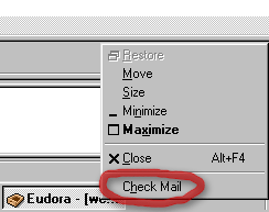 Like many power users, I close programs by right-clicking on the program icon on the task bar and clicking Close on that right click menu. Eudora, unlike every other program I've ever used, puts Check Mail last, rather than Close. On top of that, when I do hit close, Eudora asks me if I'm sure I want to stop checking mail. Yes!
I can hear the Eudora people saying, But... but... we have a divider between the Check Mail and Close button. Doesn't matter. I close using right click when I want to keep using the current program. This "window trimming" is an automatic behavior: my focus is on the other program.
In his great book The Humane Interface, Jef Raskin calls the part of the mind that deals with this kind of thing the "cognitive unconscious." Cognitively unconscious behaviors are habits: fast and automatic, but not flexible. Interfering with these behaviors is the single fastest way to piss a user off.
It also helps explain why many web designs fail: the designer, having consciously considered every part of the page, forgets the user will likely be scanning. Putting anything on the page that looks like an ad will get it ignored, for instance.
Getting back to Eudora, another annoyance: every now and then, it doesn't feel like letting you drag and drop messages from your Inbox to a folder. And then, just as randomly, it starts working again.
And finally, a micro-annoyance: I have a mouse with a scroll wheel. Overall, I love it, but sometimes I still use the keyboard. Internet Explorer (or maybe the keyboard ?) sometimes will not scroll when I hit the down arrow. You want talk about an automatic behavior? I've been using computers since I was 10 (and I'm turning 30 this weekend.)
For a good if not incredibly recent collection of user interfaces mistakes, many of them funny, check out the Interface Hall of Shame.
(Update: 04/18/2003: I haven't been able to reach this web site, I'm removing the link. It's too bad, I really liked it.)
Posted by Chad Lundgren on Thursday, July 11, 2002 (Link)
(See entry on its own, including comments)
To Hell with Bad Web Designers
There's this idea floating around that you can either follow web standards or you can be a degenerate Microsoft-lover and design only for Internet Explorer (IE).
That's a false choice. Clueless designers do tend to fall into the IE-only camp, but that only makes the web standards folks more infuriating: they should know better. I use web standards as much as possible, but if I need to use something one browser understands, I will as long as it doesn't screw up other browsers.
Web designers need inform their clients how their site works in different browsers. It should be in the contract, to avoid misunderstandings when the boss's cousin cruises by on his 386 with Windows 3.1 and Netscape 3.
But I don't mind sites that are less pretty but still useful in old browsers. What I do mind is telling users their browser sucks. The blurb on the A List Apart site is typical, and has inspired others: "This site will look much better in a browser that supports web standards, but it is accessible to any browser or Internet device." That's nearly as bad as "This site optimized for Internet Explorer" or the rarer "This site designed for Netscape, Microsoft sucks!!!" blurb.
Just show them the damn page already. Why insult your audience? Because you're waving a web standards banner? Do you think the user cares that you followed some amazingly boring rules about how it should work? Do you think the average user understands, other than to be insulted?
This is blaming the user re-invented. If there's one central tenet to user centered design/usability, it's not blaming the user. That's the philosophy: make the technology fit the user, not the user change to fit the technology. The browser elitism from the web standards people does not mesh with that.
Posted by Chad Lundgren on Monday, July 8, 2002 (Link)
(See entry on its own, including comments)
Female Viagra-Like Drugs Hit the G Spot
Ran across an [article on the ABC news web site that is no longer has available (Updated 03/25/2003)]. Basically, the bigger a woman's G spot, the more likely this type of drug will help her have an orgasm. My prediction: this will not solve as many of women's sexual problems as Viagra did for men, even for women with big G spots. Women are not that simple.
The original New Scientist story, complete with diagrams, assumes only women care where the G spot is, an entirely unwarranted assumption.
Posted by Chad Lundgren on Saturday, July 6, 2002 (Link)
(See entry on its own, including comments)
Violent, covert tips
Studies often ignore domestic violence committed by women. This doesn't surprise me. Sexist stereotypes cut both ways.
Hacktivists to release covert communications tool . This hiding information in images, or steganography, has always appealed to me. Sign me up!
Study shows Americans more willing to reward with tips[Update 09/18/2003 - Link removed since the Nando Times site was shut down]. This article has bits about tips being higher if the server is the opposite gender as the tipper and such. The IRS is being their usual wonderful self and trying to crack down on the people who get tips. You do know the IRS is cracking down less on rich people and more on middle class people because they're not as good at defending themselves?
Posted by Chad Lundgren on Friday, July 5, 2002 (Link)
(See entry on its own, including comments)
Non system disk error
Why in the hell, in the year 2002 AD, can we not have our Windows computers look at a floppy, boot using said floppy if it can, or ignore it and try to boot off the hard drive if it can't? Is that hard? Why does the system have to grind to a screeching halt?
Posted by Chad Lundgren on Friday, July 5, 2002 (Link)
(See entry on its own, including comments)
Distributed Spelling
I have spell checkers in all these programs:
Eudora, Internet Explorer (via ieSpell.),Microsoft Word, emacs, using ispell/aspell on several unix/linux computers and Dreamweaver
I'm sick of re-adding words to all those custom spelling word lists. I want my lists shared. A netcheck [Link removed 03/25/2004] of google found a way to synch your PocketPC and desktop PC versions of Word, but is too hard for most users. We need a web service anyone can use for all programs, and client-side programs that will go in and add the words to the right places for all those lists.
And imagine using other people's custom spelling lists, with a trust model like epinions or ebay. Selectively pick subculture word lists with words like bheer if you're into science fiction, sneakernet if you're into computers, theatre if you're into theatre.
"Theatre" is the trickiest example. Most programs don't allow taking non-preferred spellings like "theater" out of the primary list. You might get an auto-correct feature to do it, but then you have to hope auto-correct doesn't cause more problems than it solves.
The most common and straightforward case is new words. A search for "blog" on dictionary.com fails to produce a result even though the word blog has been around since 1999. A few people are already manually sharing custom spelling.
This relates to a previous posting, Google and Psychology Reality: if enough people say a word is spelled a certain way, it is spelled that way because the English language is an anarchy, and new words are constantly being invented. New bands and celebrities are always coming along. As with the spam-fighting tools that pool people's efforts and the distributed computing that fights cancer, we need to distribute custom spelling. How about an XML or .NET web service?
Posted by Chad Lundgren on Monday, July 1, 2002 (Link)
(See entry on its own, including comments)
Most Popular
- Seattle Sunset background image
- Usability applied to life
- Is "My Bad" Bad?
- Free Password Previewing Tool version 2.3 (146 Kb)
- Sunset in New Mexico background picture
- Bath and Body Works
- Atkins.com: Lose the Table Fat
General
Other Web Logs
Categories
- Adminstrative: 11 entries
- General: 51 entries
- Personal: 2 entries
- Photography: 13 entries
- Poetry: 8 entries
- Usability: 71 entries
Archives
- October 2006
- February 2006
- July 2005
- June 2005
- March 2005
- December 2004
- September 2004
- August 2004
- July 2004
- June 2004
- May 2004
- March 2004
- February 2004
- January 2004
- December 2003
- November 2003
- October 2003
- September 2003
- August 2003
- July 2003
- June 2003
- May 2003
- April 2003
- March 2003
- February 2003
- January 2003
- December 2002
- November 2002
- October 2002
- September 2002
- August 2002
- July 2002
- June 2002
- May 2002

Unless otherwise expressly stated, all work on this site including photos, poems, and web logs entries are licensed under a Creative Commons License.