Lazy Programmers are Bad
The Comcast DVR (the Scientific Atlanta Explorer 8000) sucks so much more than a Tivo that it beggars belief, showing that lazy programmers can be bad:
1. When three shows conflict, it complains and gives you the option of canceling one. No, not the one episode that conflicts, the ENTIRE RECORDING, forever into the future. I lost a number of shows to this before I realized what was going on. Laziness extraordinaire.
2. When you are watching a show that is being recorded, and the recording finishes, the DVR does what's easy for it, not the viewer, stops the recording, and dumps you out to watch the channel that was being recorded. Since Jeopardy is on right before the awful Wheel of Fortune, this is especially unfortunate. When I had the Tivo, as I recall, it would sometimes pause for just a bit while it finalized the recording and then continue: the right behavior, not the lazy one.
3. I thought the Tivo interface where you use the video game style alphabet square to input two or three letters to look up a show to record was clunky until I started scrolling through 80 pages of "S" entries because the DVR is too stupid to let you narrow it down more than that. Oh, and you can only look at one day of "S" entries at a time.
4. This seems like a good time to mention that the remote is even slower than the somewhat sluggish Tivo remote.
5. The on-demand is buggy. If you switch to the on-demand channel and dare to change the channel while it's trying to connect, about 85% of the time, the DVR reboots, apparently just because the channel number and what's being displayed no longer sync. Talk about lazy!
6. When unattended, the DVR starts to act up like a bratty child seeking attention. It un-pauses shows way too quickly, and changes itself to "random" channels which all seem to be pay-per-view. Even more bizarrely, when it does un-pause a show, it goes into infinite loop mode and plays the same show over and over and over. Is that supposed to be an anti-theft deterrent?
6. The box only has one week of program schedule data. Now, given the problem with schedules changing, you might think that was a good thing, but it downloads a new schedule every night, so that shouldn't be an issue. The real problem is that if you encounter a new show you like, you have no way of knowing if it's a one-time special or on every week.
Here's the one positive thing about the Comcast DVR :
6. It has a dual tuner that records shows straight onto the hard drive.
Here's hoping the Tivo Comcast works much better. Here's hoping it actually materializes—if not, I'm switching back to the Tivo, dual tuner or not.
Posted by Chad Lundgren on Monday, February 6, 2006 (Link)
(See entry on its own, including comments)
Parsley is a kind of lettuce
So I went shopping about a week ago, and it took way too long. One reason is that my shopping list had listed:
- fresh basil
- fresh oregano
- fresh parsley
I was feeling ambitious, so I went to the organic chain down the road for the spices and veggies, as a separate trip from the one to the main supermarket. I went to the refrigerator with the flat packs of fresh herbs. I found the basil and oregano immediately, but couldn't find the parsley. They seemed to be out of it, like they were out of the fresh dill. I didn't actually see the tag for parsley, but I was tired enough at that point where that didn't click.
So I got mad, left with what I had, and went to a different organic store. They too were out of parsley, as I exclaimed to my good friend Monte, who happened to have called me on the cell. "Did you look in the lettuce section?" he asked. "The lettuce section? Why would they put it there?" But, sure enough, there it was.
How is parsley not a spice?
Here's another example of poor classification that occured at a "regular" supermarket recently. My wife requested that I purchase some new dishwashing sponges. So I headed to the non-food side of the store, and soon spied the dishwashing detergent. Sadly, they had only refills for some automated scrub brush contraption I wanted no part of, but no scrub brushes. I started wandering up and down the aisles and discovered a small dish sponge/scrub brush section hidden on the "Baby" aisle. We're talking pampers here people. There were other signs at the end of the aisle but none even hinted at dish sponges.
What? The only thing I can figure is that, if I were a completely sexist store layout designer, everything on that aisle could be thought of as "for women".
My wife, upon hearing my rant, admitted that she knows exactly where the parsley lives in the supermarket, but seemed to find the scrub brush location odd.
My overall point: I often find myself longing for a search box as I wander the aisles of the supermarket. The way my brain works and the way supermarkets categorize things often does not mesh.
Update: A more recent trip to the same grocery store chain that blew the scrub brush location showed they put the parsley under the herb packs, and the whole section directly next to the lettuce, so either way of thinking about it would get you there.
Posted by Chad Lundgren on Tuesday, June 28, 2005 (Link)
(See entry on its own, including comments)
Adobe Acrobat Updates Broken
Adobe® Acrobat® Reader® has long been a whipping boy for usability types. In fact, here on Zen Haiku, I've dissed Acrobat before. Well, I'm (re)joining the fray.
I went to look at a PDF file, and this is what I saw (shrunk down a bit to fit in my web site):
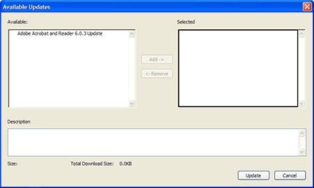
Why isn't the update automatically selected? What's up with making me pick an update when there's only one? It's an update I didn't even want! Like most people, I just wanted the stupid update over with, so I hit Update and received an error message about nothing being selected.
Just as bad is the way this Adobe update window usually disappears below my web browser, apparently crashing it. It got so bad in the past with the Adobe® Photoshop® Album Starter Edition constantly being suggested that I actually downloaded and installed the damn thing, although I never use it.
My current solution is to "File, Save As" PDF files and look at them outside of Firefox, but of course, a few enterprising web sites have javascript links that break this approach.
Posted by Chad Lundgren on Thursday, March 10, 2005 (Link)
(See entry on its own, including comments)
Turning the Sound off in Ad-Aware 1.05
Spybot Search and Destroy was my mainstay in keeping my Windows system free of spyware until recently, when Lavasoft released a new version of Ad-Aware. Ad-Aware had been my favorite but wasn't updated for a long while.
The software is thorough and currently has frequent updates. There's only one problem. When it finds a piece of spyware, it uses this godawful alert sound that made me jump the first time I heard it. Just today, I left Ad-Aware running in the other room, and went to the next room to greet my wife Karen just home from work, and she jumped about three feet sideways when that "BLAT" noise came barreling out of my subwoofer. Making me especially mad is that I thought I had already turned it off.
Lavasoft has succumbed to the dreaded WinAmp disease: let's make the interface skinnable, cool and mysterious. So it took me a while to figure out that the icon with the gear on it is for settings. Once there, I scanned the list of buttons on the settings window, and decided that "Interface" is how I would turn the sound file off.
So I blanked out the file name for "Play This Wave file if Targets Are Found" field in question, and saved the change, figuring it would stop playing it. No luck. Finally, under the "Tweak" option, under a sub-category called "Misc Settings", I found the option that turns the sound off. (To be honest, I had already deleted the sound file, but now I was mad.)
Why not make blanking the file work, or at least indicate it didn't, rather than silently (or noisily!) failing? Better yet, why even make noise at the user in the first place? If it were any other program, behavior that anti-social would be cause for immediate removal.
All said, I have to recommend you look past the interface and download Ad-Aware. It found things Spybot missed, and cleans out your system restore files. I've already had to use a system restore that had spyware in it, so I appreciate the thoroughness.
But don't forgot to turn that infernal sound off. To summarize, from the main window, click on the button with a gear on it, click on "Tweak", then hit the plus sign on "Misc Settings" to show both options. Next, click on the green check mark next to "Play sound at scan completion if scan locates critical objects" to change it to a red X mark, and click "Proceed" to actually save your changes and turn the sound off, and then scan in peace.
Posted by Chad Lundgren on Friday, December 17, 2004 (Link)
(See entry on its own, including comments)
Compass Banking Bill Pay
So wanted to add Bill Pay to my Compass Online Banking. Much hilarity ensued.
Many faxes happened. It wasn't until fax number 3 that the Bill Pay option on the web site showed up. After figuring out that I need to "Add a Payee", I tried, and no matter what, I received this error message.
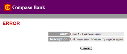
"Please try signon again"? What kind of wording is that? And what is an "Unknown error"? I tried taking spaces out of the account number. I tried it in Internet Explorer, to no avail. I even "tried signon again". It reached the confirm page just fine, and then, every time, the same error message, when I tried to actually submit.
So I called the tech support, who said to fax the form. The same one I've had faxed 3 times now. Oh come on. They told me it'd been turned on but not authorized. What? How is that even possible? Oh, and they had to turn it off so it could be turned on properly.
After insisting that I had indeed faxed it, I got put on hold. They couldn't reach the person they believed to have one of the three faxes, so they were going to get back to me. I gave them my phone number.
They never got back to me. (You knew that was coming, right?).
A few days later, I called them again, and ended up going in and faxing the form for the fourth time. This time, it's addressed to the person I talked to, and it finally worked.
While on Thanksgiving holiday, at the folk's house, I signed on and added "Comcat" as a payee. Once saved, you cannot edit the official payee name. So I had to delete "Comcat" and re-enter everything under "Comcast"®—just to fix one letter. So I went in and added some people and sent off a payment.
Here's hoping the actual bill paying goes more smoothly than the signup.
Posted by Chad Lundgren on Thursday, December 2, 2004 (Link)
(See entry on its own, including comments)
Lowes.com: Zip code, what zip code?
I'm looking for replacement vertical blinds late at night. I go to Home Depot's web site. They don't have the height I measured. So I go to Lowes, with a vague impression that they try to be a more accessible hardware store.
I see a good category (Doors and Windows), so unlike at the Home Depot site, I use a category approach instead of a search. It takes me a second to choose the jargony "Window Treatment" subcategory.
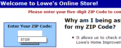
Then it asks me for my zip code. Surprisingly, I don't even mind, possibly because it promises to check inventory for me. I just punch it in. And then Lowes proceeds to send me to the same page and ask me for my zip code. Again.
Being the clever web monkey that I am, I notice my trusty status bar showing another web site that Lowes site is talking to. Ah, I said, they are trying to give a cookie to some other web site, and have programmed stupidly so that if that doesn't happen it fails. So I change that setting to allow that. And it still doesn't work.
Miffed, I try over and over again. I can get it to fail if I enter random letters, but never to suceed. Weirder. Finally I sigh and think, maybe they're so clueless it only works in Internet Explorer, not Mozilla Firefox. No such luck. Maybe they forgot about New Mexico? Nope, 90210 doesn't work either. It really does seem to be broken. Worse, it fails silently, dropping me onto an identical page.
I'm a motivated buyer, I want to march down there after work tomorrow and buy blinds and they can't show me what they've got. Oh, the other option is to register. Guess how much I want to try that after they can't even deal with a simple zip code?
Update: Monday evening, I thought maybe I'd been too harsh and checked back. The site seemed to be working this time: my zip code actually took me to the Window Treatment category. Deciding I didn't want to see all the curtain stuff, I did a search for vertical blinds. I looked at one of them, then saw a link that promised to show all products in the vertical blind category. I clicked on it. It just sat there. I switched to another tab for a while and then back again and it still hadn't come back. Buh-bye!
Posted by Chad Lundgren on Monday, September 27, 2004 (Link)
(See entry on its own, including comments)
Hidden Information Strikes Again
Without bothering to ask us, our hosting company decided to move us to a new hosting center. Since my wife and I use a reseller package (for zenhaiku and a number of other sites), we have our own DNS servers. OK, they just point to someone else's but close enough.
(Crib sheet for non-techies: DNS means Domain Name System. It's the system that takes a name like www.yahoo.com and turns into an IP Address, which is the unique number used to send anything on the Internet. Oh, and nameservers are the computers that hand out the numbers).
Regular visitors or RSS subscribers may have noticed the site was down for a week. This was due to a comedy of errors that kept on piling up, since some DNS changes take 2-3 days to go through. Things started to turn around when I work up at 5 am two days ago determined to double check everything.
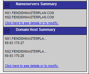
The first problem had been solved: all the websites were talking to the right nameservers. However, the IP addresses for those nameserver themselves were wrong. So I went back to the domain name site and looked at it again, and pretty much clicked on everything. I looked at the right sidebar.
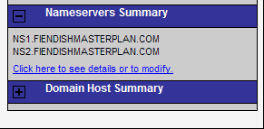
Which is when I noticed these little boxes, which I had thought were decorations. The incredibly low color contrast of dark blue on black obscures the plusses and minuses they have.
So I clicked on the plus and lo and behold, the wrong IP addresses showed up, complete with a link to modify, which I did immediately.
Here's what the expanded version looked like.
But wait, there's more! I got a call from my brother, who said, there's something wrong with your site. I said, I know, I've been working on it for nearly a week now, and he said, no, it's not down now, it's just weird.
Turns out the wrong site was being served. Logging into the reseller control panel revealed that the IP address all the sites were listed as using were different than the ones we set up, on the instructions of the web hosting people. So I changed it to what looked like the correct IP address, and called my wife at work, and she saw the correct site.
So some people are now (August 18, 2004) seeing some random fan chat site about musical group Matchbox 20 instead of this site. Eventually, things should straighten out. I would still be seeing that apalling site myself, except that I made my computer use the right IP address, which is how I'm posting this in the first place.
I'm still not convinced it will stay working. It's week's like this where I'm totally frustrated with the Internet.
Posted by Chad Lundgren on Wednesday, August 18, 2004 (Link)
(See entry on its own, including comments)
Sprint PCS® Customer Service Follies
I was trying to get my wife Karen's defective cell phone replaced. The repair place had never seen the model in question and the national phone number, which I had to call 4 times to get a human, said they couldn't just send a replacement because it's not being made any more.
I used the store locator on their web site and got the number of the local repair shop. I dialed it, and the option for customer service kicked me back to the main line. I called back and hit "0" right away.
The response? An automated "Good bye". And they hung me up! What's up with that?
I combed through the invoices one at a time ooking in vain for anything detailed about the phone in question to prove it's still under warranty. There is no search function—all the bills are in PDF. Never mind that the one helpful person I talked to on the national number told me the activation date put it under six months).
Later, after going back twice, we managed to browbeat them into doing the right thing and replacing the defective cell phone. The new cell phone had this crappy imitation of the Mac OS X Dock, which Ask Tog (Bruce Tognazzini, a former Apple employer) has already trashed for its poor usability, that my wife had to turn off before she could stand to use it.
Posted by Chad Lundgren on Monday, June 28, 2004 (Link)
(See entry on its own, including comments)
Funny error message
So I'm reading some science news about John Gottman and Robert Levenson, who have developed a mathematical model to predict with a 80% or higher accuracy rate whether a marriage will last. Interesting stuff: essentially, in marriages that last, positive interactions outnumber negative ones by a 5 to 1 ratio or more, creating a sort of bank of postive feeling to help couples recover from the inevitable arguments.
So I want to read an actual paper, but am having no luck on the Gottman Institute web site getting from an abstract page to a paper. After several tries, I click on this abstract and read it, then try to go to the actual journal page.
The error message I get is "You have entered a phrase that is too generic. Please try again."
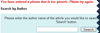
What? Running a web site like Zen Haiku, I understand why the link went stale, but that's still an awfully strange error message.
Posted by Chad Lundgren on Tuesday, March 16, 2004 (Link)
(See entry on its own, including comments)
Entering credit card numbers
Bruce Tognazzini writes in his Ask Tog column Top 10 Reasons to Not Shop On Line:
"...Why can�t I input my credit card number the way it appears on the card? Why do I have to suck the extra spaces out, making it all but impossible to re-scan it for errors? We�re talking three spaces here, three bytes." (via Usability Views)
I will quite often try to see if a credit card number field gives me enough room to enter it with spaces. If it does, I will then delete the spaces because I know so many places can't handle them.
Any of you web programmers out there, tell me you couldn't write code to strip three spaces out of a credit card number? We're talking regular expressions 101 here.
In a similar vein, I once asked a programmer I was working with to allow social security numbers to accept both no spaces or hyphens, and they told me the code to take hyphens out was easier than the code insisting the user enter it without hyphens.
Posted by Chad Lundgren on Tuesday, February 10, 2004 (Link)
(See entry on its own, including comments)
Atkins.com: Lose the Table Fat
Disclaimer: Those sick of hearing about Atkins® may not want to read this.
Atkins.com has a bunch of recipes. They are reasonably easy to find with a search or by browsing.
There's also a recipe box. The recipe box forgot to to add things half of the time, and when I returned a week later, it had forgotten all my recipes.
It has a phase 1 (or induction) choice if you browse their recipes. Great. It has 267 Phase 1 recipes (as of Jan. 12 2003). But there's no way to search WITHIN those Phase 1 recipes. (Phase 1 is the phase in which you must eat fewer than 20 grams of carbs a day. )
Why wasn't I just using the search engine? That's because the first time I tried, there were no recipes responding to the search 'Phase 1'; the second time I searched a week later, there were 34 matches, of which (3) three had phase 1 in their titles: all the others had another phase label, or no phase label. Useless!
Oh, and when you do go browse 267 recipes alphabetically, page numbers are just as useless. I need a yellow pages A-B, C, D-E listing style. Instead, I'm guessing at where the S recipes might be and clicking on page numbers.
And finally, the site is often painfully slow. This is probably mostly due to the overwhelming popularity of Atkins right now, but the bloated table-based layout, with tiny fonts done as graphics that could easily be done as text, can't help.
Posted by Chad Lundgren on Monday, January 12, 2004 (Link)
(See entry on its own, including comments)
Replying with Attachment...or Not.
How many times have you had to send that second, embarassed email, saying, OK, this one REALLY has the attachment I was talking about in that first email.
Wouldn't it be nice if your email program asked you about sending an attachment, or had a Reply with Attachment that made you pick the attachment first before you wrote your email? It turns out someone at the Why Not? site has thought of this already.
In fact, the Why Not? Site has this and other interesting ideas, many in the spirit of usability.
Posted by Chad Lundgren on Monday, December 22, 2003 (Link)
(See entry on its own, including comments)
No WWW? Not!
Some misguided folks feel that the "www" that goes in front of most web sites is redundant, and should be done away with.
These "No WWW" folks are wrong. Many, many people, are convinced that the "www" is required, so that if you tell them to go mywebsite.com, they assume you mean "www.mywebsite.com". Companies that don't make the "www" version work are missing the boat.
But they don't insist you make the "www.domain.com" fail. What they do advocate is changing the URL from "www.domain.com" to "domain.com" when you use the "www" version. Why not just leave it the way it was? It's a subtler version of a "Your browser sucks" message. It's just plain rude.
Posted by Chad Lundgren on Tuesday, November 25, 2003 (Link)
(See entry on its own, including comments)
Computer, Cancel Last Command
Mac OS X ships with a neat-sounding feature called Speakable Items. -- supposedly all you need to do is enable a little listener program and you can start verbally abusing your computer.
At first only one in every few commands seemed to work. My attempts to issue the command "Tell me a Joke" in a progressively louder and louder voice succeeded only in providing my coworkers with irrefutable proof that my mind is as leaky as a sieve.
I thought I might have the volume on the microphone turned down too low, so I went into the Preferences to check it out...much to my surprise, the volume was actually set too high.
Once I had the volume properly tuned, the computer began to respond to about 80% of my commands -- at least as obedient and responsive as the average human, in my opinion. When I was satisfied that it worked reasonably well, I called in a coworker to show her my neat new parlor trick.
As the Law of Singing Frogs would dictate, the program would not respond while she was paying attention. When she went away, bored by the lack of response, it started working again. My current suspicion is that the microphone is sensitive enough to pick up her breathing, which interferes with the recognition algorithms.
Still, when no one was looking I could issue commands such as "Switch to Mail", "Reply to this message", "What time is it", "Log out", etc. and usually get the behavior I was after. Even when it's working properly, however, the Speakable Items seems only marginally useful.
It's missing one key feature; the ability to print what I say. Currently I can instruct my computer: "Computer, Switch to Mail. Get new messages. Reply to this message." But until I can also tell Ethereal "Take dictation," I am not likely to bother.
Posted by Karen Donovan on Saturday, September 13, 2003 (Link)
(See entry on its own, including comments)
Web Site Weirdness
What's wrong with this picture, seen at the ITEC registration site?
(ITEC is an information technology conference)
Posted by Chad Lundgren on Tuesday, September 9, 2003 (Link)
(See entry on its own, including comments)
Universal Design: Usability for your home
I've heard of ergonomics, but I hadn't heard of Universal Design, created at the Center for Universal Design. Its original goal was homes that are accessible to disabled people, but its benefits extend to the rest of us. Putting power plugs higher may benefit wheelchair users the most, but higher power plugs would mean I wouldn't have to crawl or bend way over to unplug things.
Universal design's affinity with usability is clear from a sampling of its seven principles: Principle Two is Flexibility in Use, Principle Four is Perceptible Information, and Principle Five is Tolerance for Error.
This idea resonated with me, because my former apartment had locks installed upside down, a bathroom door that was stuck enough to require force to open, and my current apartment has vertical blinds that constantly jam up, and a dryer dial I found irritating. All these little annoyances add up to make daily life more irritating than it has to be.
This approach was named by the late Ron Mace. I ran across it on (via Realty Times) which mentioned it as a new trend in home design I find most encouraging.
Posted by Chad Lundgren on Friday, July 25, 2003 (Link)
(See entry on its own, including comments)
Are PDFs all that bad?
Jakob Nielsen is Mr. Unequivocal again on his latest alertbox: PDF: Unfit for Human Consumption. Despite that, I'm cautiously optimistic about the promised next column about making PDFs work better.
One technique I like is opening PDFs in their own window, using one usability sin to cover another, since users often end up closing the browser window and thus their whole browser when a PDF file is opened.
And I don't buy the Adode myth that everyone has the PDF plugin. Having done field usability tests, I've noticed more users than you might expect simply don't have the plug-in. I have no hard numbers, but keep in mind that Internet Explorer has come built into Windows for some time now, while on many computers, PDFs are still a separate download. Try telling a user to go download 8.7 Megabytes over a dialup connection.
Another PDF annoyance: on Windows 2000 using roaming profiles, you have to accept the license agreement the first time you open a PDF file each session if that setting isn't saved between sessions. Occasionally, the window asking you to accept the agreement gets lost and appears to crash your browser.
Posted by Chad Lundgren on Thursday, July 17, 2003 (Link)
(See entry on its own, including comments)
Bath and Body Works
The Bath and Body Works site is worthless. I was trying to find out if they had a shea butter lotion as a gift for my girlfriend Karen to replace the stuff she's running out of.
On the home page, my navigation choices are "Home", "The Solution Center", whatever that means, "New This Season", which is obviously wrong, "FAQ", "Locator", and some sign-me-up-for-spam thing. All use tiny fonts done as graphics, so they can't be resized.
I want a "Products" link! How about a "Our Stuff" link if that's not hip enough?
It stays just as bad. They have three columns. The middle column has a big picture and a list of products under it. This layout implies you can look at individual products, but you can't. [Update 03/12/2004 - I foolishly did not get a screen shot, so now of course the link is broken, and has been removed.]
There's no site map, so I get the nagging feeling what I want is there, but I can't find it. My theory is that the package has changed but the scent is the same, but I can't know for sure.
Eventually, through the random thrashing method, I find a shea butter page, but it says nothing about what scent it has. If I hate the scent, I won't want to keep smelling it.
Finally, I gave up and went to the store. Sure enough, the same stuff is now in that blue bottle and it has the same scent.
Posted by Chad Lundgren on Saturday, June 14, 2003 (Link)
(See entry on its own, including comments)
My DVD player flashes 12:00!
I've recently started a job involving supporting a consumer electronics device, so I've been thinking about the usability of consumer electronics a lot lately. The piece of equipment in question has a phone jack. Not too infrequently, the other end of the phone line ends up plugged into a satellite dish box, not the wall.
The plug on these satellite boxes allows another device to control them. But the makers clearly did not understand that your average consumer finds which plugs fit, and starts plugging things in. Those who have read their Donald Norman call these perceived affordances, or affordances for short. My one sentence gloss: What does it look like I can do with it?
The most famous example of affordances from Donald Norman's book Design of Everyday Things is doors. A pull handle should indicate that the door is opened via pulling. A push plate indicates the door should be pushed and which side to push on. The infamous convenience store doors with pull handles on both sides are a common example of ignoring this idea.
Other people have written about the usability of consumer electronics, or the lack thereof. I also found a story about a GE dishwasher I saw on WebWord amusing.
Speaking of GE, all this inspired me to photograph a dial on the GE dryer in the apartment my girlfriend and I moved into recently.
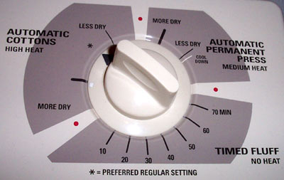
Since I was not wearing my contacts, I peered at this dial from about 3 inches away and was audibly annoyed because I was looking for the 60 minute drying setting. The only timed setting available on this dryer is for fluffing. I do not trust my dryer to know what "More Dry" and "Less dry" really are. And what's up with the "Preferred Regular Setting"?
Posted by Chad Lundgren on Tuesday, May 20, 2003 (Link)
(See entry on its own, including comments)
Adobe Acrobat Download Usability
I wanted to download the Adobe® Acrobat® Reader® for a friend who lives in the boonies and is relegated to a dialup. But the Adobe site seemed to be insisting I use an online installer, that smallish program you download to get the big one. I hate those--you can never save the file for giving to friends, or for yourself if you need to re-install.
After a bit of thrashing, I clicked on the text only page and got the FULL Adobe Reader program download, all 13 steaming Megs of it.
Oh, tangentially here, it seems there is a move afoot at Adobe to call it the "Adobe Reader" and lose the Acrobat part. Well, I have news for their marketing department: I still sometimes refer to a supermarket near my apartment as Skaggs, which is 3 names old. I also like the triply-register-marked name so much I did it here too.
To avoid gratuitous negativity, I should mention that the much-needed File, Save As option finally showed up in version 5. It's possible they've smoothed out other rough usability edges from prior versions.
Posted by Chad Lundgren on Monday, April 14, 2003 (Link)
(See entry on its own, including comments)
Mozilla to become more like Phoenix
Since I've become a big fan of the Phoenix web browser, I am cautiously optimistic to hear that the new direction of Mozilla is to make it more like Phoenix starting with Mozilla 1.5.
My main question: does this mean that Mozilla 1.5 is going to have a real Home button? I hate "the home button, or, to be more precise, the tiny, misplaced thing they shriveled it into..." (quoting myself) in Mozilla 1.x/Netscape 6/7.
Posted by Chad Lundgren on Thursday, April 3, 2003 (Link)
(See entry on its own, including comments)
Paco Underhill and usability
I just finished The Science of Shopping by Paco Underhill, a retail anthropologist who studies how people shop.
I liked the chapter on online usability. Especially interesting: his idea of paying for something online but picking it up at the store, thus avoiding checkout hell. I often buy something locally after researching it on the Internet because I want it now. I also loved his idea that stores should have a men's health section, in which all the shaving supplies and the like would get their own section, instead of the odd situation now where they are mixed in with women's stuff.
Underhill talks about women as the dominant shoppers. In the computer world, women tend to not care about raw Megaherz figures. They want style and an 800 number and ease of use.
The same is true of the usability of digital cameras, which manufacturers are taking more seriously now. Speaking of color cameras, read all about color and usability as they relate to blenders and credit card machines. I've noticed the bad usability of those credit card swipe machines and so read with delight the story of a machine with a tiny blue "Yes" button.
Posted by Chad Lundgren on Thursday, March 20, 2003 (Link)
(See entry on its own, including comments)
Usability Linkage and a Blast from the Past
Speaking as Mr. Usability Applied to Life, here's the amusing A Heuristic Evaluation of the Usability of Infants (via IDBlog, by Beth Mazur, whose blog I've just started reading and am liking).
Scott Berkun has an article archive worth a look, in particular his recent How to get the most out of conferences, which includes how to convince your company that conferences are worth it in these fiscally restrained days. He also advises sticking with daily exercise while at conferences, which apparently keeps his mood from getting cranky. That's true to nearly the same extent about me.
And, speaking of cranky moods, here's a blast from the past. I wrote an article kvetching about the search offered by Dealtime.com way back in October of '02. I complained about the fact that when you blanked out the minimum and maximum price fields, they were re-filled with the old values. [03/25/2004 - Link to Dealtime removed - it's being forward to shopping.com]
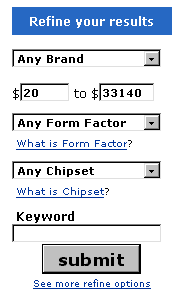 Well today, March 14th 2003, I received a comment from someone presumably at Dealtime explaining that they showed the lowest and highest prices for that category. In the category in question, the highest was "33140", which I'd assumed was a maximum default, not a real price. It was not clear whether that was a real price or not.
But pre-filling the values is not the annoying part: re-filling the maximum after I had deleted the text is. They took user input and threw it away.
A better approach is the way Photoshop does it. I want a lot of files on my most recently used list. So everytime I (re)install or reset my Photoshop preferences, I punch in 100, and Photoshop substitutes the max. And it tells me what's it doing, getting the closest it can to what I asked for.
In the Dealtime case, I would find it less annoying to have a 0 substituted than the original big maximum number. Or, if you're doing something as disruptive as changing user input, you may as well show an alert box explaining, look, this number is the max, even though it doesn't look like it.
In usability as in life, you have to look like you're doing the right thing, as well as actually doing the right thing.
Posted by Chad Lundgren on Friday, March 14, 2003 (Link)
(See entry on its own, including comments)
Usability Links
Now here's a usability story worth taking seriously:
Child car seat instructions too difficult. [Link first changed 04/18/2003, orginal link via IDblog. Link changed again 03/25/2004. ]
Daniel Kapusta rants that dishonest links must die. All about a link that seems to be pointing to a movie but then went to a signup page. Oddly enough, it was a javascript link the first time I went, but now it matches the way he saw it.
Apropos of nothing geek-oriented thought for the day:
You know you're a geek when you drive down Signal Street looking for Noise.
Speaking of links, I have an annotated links page. I don't know why more sites don't bother to explain why you'd want to go to a site on said link pages.
Posted by Chad Lundgren on Sunday, March 9, 2003 (Link)
(See entry on its own, including comments)
Trashing Ready.gov and other blog sports
The Ready.gov "safety" icons are scary, but the fact that a federal site is not accessible is even more scary.
Take a look at this page featuring lovely chemical warfare infographics. If you try to click on the "next >" choice, nothing happens. A closer look reveals that the link is a javascript link to nowhere. This is a usability and accessibility gaffe.
Just turn the text off. How hard is that?
Update: The javascript link is gone from the "next >" on the last page, but that still begs the question: why even show the "next >" option on the last page? And why is "next" lowercase?
Posted by Chad Lundgren on Friday, February 28, 2003 (Link)
(See entry on its own, including comments)
America's Army: Video Game Propaganda
Critics have often said the (First?) Gulf War was a video game war. Perhaps the notoriously literal-minded military did not realize that was not meant as a compliment. At any rate, America's Army is an officially endorsed video game from the Army. It's a first person shooter with online multiplayer, involving teamwork, more camouflage than you can shake a stick at, and being yelled at by drill sergeants.
Pages of tiny, unresizable text about teamwork, reminiscent of horribly bland, Pollyanna-ish corporate mission statements, greet you as you enter basic training:
"[Basic Training's] purpose is to transform young American volunteers into disciplined, motivated, physically fit Soldiers who believe in teamwork and espouse the Army's seven core values: Loyalty, Duty, Respect, Selfless-Service, Honor, Integrity, and Personal Courage."
Here is an non-exhaustive list of issues:- The download is well over 300 Megs. It took 3 tries to get all of it. The first two tries stopped 70KB short of the end. I have a cable modem, but it still annoyed.
- Not even counting the 300 Meg download, the install, to put it politely, blew. Why did it install the .NET FrameWork? Why did the reboot of said .NET framework screw up the main install, which I had to re-start? Why did I have to make my own shortcut?
- The online registration sucks. Not only is the server slow, I never received my email with the passwords in them, even with two tries. I finally was able to get a forgot password email sent. (Do I really need to say that registration is required? About the Army?)
- Why did the game forget that I had completed the marksmanship course—twice? You have to pass basic training to play in the online games.
- Speaking of online games, why doesn't the server list exclude servers I don't have a high enough level for?
- The game freezes and crashes occasionally.
- Most annoying is an obstacle course designed to teach you how to move, in which one a wall/rope climb kept stopping me, and the help did not explain why (it said keep right, I kept right and it still made me start over again.)
I did find a few pluses:
- During boot camp, if you shoot the drill sergeant, the weapons handing out guy, or the dude in the tower keeping an eye on the shooting range, you get sent to a nicely stereotypic jail cell, complete with a harmonica echoing in the background.
- The aiming features realistic breathing effects, especially noticeable with the scope.
- The ability to say, oh, the latest piece of government propaganda? I played it.
Posted by Chad Lundgren on Sunday, February 23, 2003 (Link)
(See entry on its own, including comments)
Usability: Neccesary but not Sufficient
So does usability matter? (Via WebWord)
Commenter Albert D. Kallal makes a good point about Quicken being a useful product that broke new ground. Quicken did something useful: allowing regular people to do accounting without accounting arcana.
However, usability is not the same as effectiveness. A product that is easy to use but does nothing useful is not enough. Nor is usability (or effectiveness) alone enough to make a product successful. Other things must be there: the right price, support, marketing.
Usability types are prone to over-emphasizing the importance of usability: I am no exception. But good usability is hard to notice, and bad usability smacks you between the eyes, so it's not surprising that usability still has a ways to go. I stress usability because it still needs to be stressed: in an ideal world, it would always be an integral part of the process.
Posted by Chad Lundgren on Friday, February 7, 2003 (Link)
(See entry on its own, including comments)
Opening a Link in a New Window: It Depends
Should links to external web sites should be opened in a new window? Danish usability guru Jakob Nielsen says a typically unequivocal no, as does accessibility site Dive Into Mark.
But accessibility wonk Shawn Lawton Henry opines that you shouldn't unless you have a good reason. So you can imagine my surprise when she opens a PDF in a new window. But a closer look reveals this nuance: "There are good reasons to use spawned windows, such as to provide help for a form without losing data and context. "
And opening a PDF is a good reason because users tend to close the whole browser window when done viewing a PDF. Using one usability problem to cancel another out appeals to me greatly. However, I missed the icon, so "link opens in a new window" might well be better.
Posted by Chad Lundgren on Tuesday, January 28, 2003 (Link)
(See entry on its own, including comments)
Joshua Kaufman & Anitra Pavka: Keeping me (More) Honest
In the past, I've improved Zen Haiku based Joshua Kaufman's postings on his web log or comments on mine. I may even be dragged kicking and screaming into using <cite> for citations and the <abbr> tag for abbreviations like CSS. I'm not clear why I'm a big fan of structural markup when it comes to headlines but not abbreviations.
So just now it occurred to me on reading Joshua Kaufman's mention [03/25/2004 - link removed] of a CHI-WEB posting by Cindy Lu about required form fields that I did not indicate which fields commenters must fill out. I like the Movable Type default of requiring Name and Comment and either Email or URL.
So now I am indicating which fields are required for a comment to be allowed. I like the word "required" more than the "*" marking.
I wonder how many usability web loggers have bothered to run usability tests on their own web logs. I know I haven't. Now that I have a search on the site it could be fun.
Switching gears slightly from usability to accessibility (that word is hard to spell right), Anitra Pavka is the accessibility site I visit the most. She linked to the Wave 3.0 alpha accessibility tool just as I started making Zen Haiku more accessible.
Posted by Chad Lundgren on Monday, January 13, 2003 (Link)
(See entry on its own, including comments)
Wireless Usability etc
William Hudson of Syntagm and CHI-WEB makes good points in Crossing the Wireless Chasm about the wireless industry ignoring usability. My favorite bit: "WAP (Wireless Access Protocol or What A Palaver)" —emphasis and definition link mine.
Other tasty reads on the Syntagm site include: Welcome to Nirvana: Naïve Beliefs of Usability ("Many web sites would rather force users to click ten times with the mouse than to allow them to type in a simple date - and usually in the middle of a series of alphanumeric fields.") and one in which I have a personal interest: Navigate on the right? The jury is still out.
He also has a nice Usability 101 page, with a very British-sounding computer saying "Shan't." in a dialog box. It includes the Jakob Nielsen five dimensions of usability: Learnability, Efficiency, Memorability, Errors, and Satisfaction. (from Usability Engineering, one of the first books I read, although my favorite book so far on the practical side of usability testing is Jeffrey Rubin's Handbook of Usability Testing, particularly the need to be zen during usability tests (more specfically, a detached observer).
Posted by Chad Lundgren on Thursday, December 26, 2002 (Link)
(See entry on its own, including comments)
The Usability of Movable Type
Preface: I have registered Movable Type at the $45 level.
Here are my usability notes on Movable Type. Some or all of this will not make sense to people who don't use movable type. So don't get all learned helplessness on me, look it up or don't read it. :-)
1. When you're editing a template , you have two buttons. Save, and Rebuild. Save does what you'd expect, which is to save the entry into the database. But Rebuild does just that: rebuild. It does NOT save the changes you just made. You have to hit Save and THEN Rebuild. Why not make Rebuild have an implicit Save of whatever changes made on the current screen?
2. Speaking of Rebuild button at the bottom: why not call it "Rebuild just this entry"? It took me some time to realize the rebuild button at the bottom rebuilds just that template or entry, which is faster. Why hide this cool functionality behind a name that is not specific enough.
3. Why doesn't clicking in the image upload field pick the radio button? A graphic:
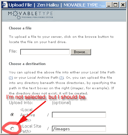
Granted, I'm odd because I fill in the path before I pick the file name, but I don't think that affects the point.
4. Installs and upgrades are gratuitously hard, mainly because directories are not in the right place, not even to match the default set up. Things that need to end up in the static directory are not there when you uncompress it. Even granting that Movable Type is not trying to complete with blogger, it's still not as easy as it could be. Make the defaults to where everything works, and does not require mass moving of files.
5. Better defaults: Why not make title-based filenames the default style for individual entry archives? In other words, the default looks like: /archives/000053.html, instead of /archives/like_my_life_is_so_like_boring.html.
It took me a lot of googling to get the right format: annoyingly enough, this feature is mentioned prominently, but I could not find how to actually do it from the Movable Type site itself.
Speaking of which, here is the gory details of how, it's actually relatively simple:
Once you're in your blog, click into Blog Config, and select the Archiving section. Then, in the empty text box next to "Individual Entry Archive" paste this code:
<$MTEntryTitle dirify="1" $>.html
"dirify" means change files names from "Like%20whatever.html" to "like_whatever.html" Good functionality, wrong default. Why do you need to add the dirify tag at all? Why would you ever want nasty filenames with spaces in them?
7. The date is set once, when you first create a post. It is not automatically updated as you work on it. I often edit my posts over days rather than hours. I don't require my posts to be completely polished, but I like them a bit shiny. So the posting dated December 11th was indeed started on December 11th, but was not posted on the 11th as you might expect, but only a few days before this post (where I have updated the date).
And, to end on a positive note, good points:
1. Use of accessible templates starting with version 2.5. Accessibility is not usability, but it goes together well.
2. XHTML/CSS setup from the get-go.
3. The cost.
4. The ability to easily donate via PayPal, but no high pressure tactics, just a nice request.
5. The automatic re-building of archives, frees you to focus on the content.
6. With newer version of Movable Type, TrackBack auto-pinging. This means that you don't have to remember to do TrackBacking: it attempts to ping a site automatically. Trackbacking itself is a cool idea that I feel could have been explained better in the beginning.
Some of the changes I'm suggesting are Javascript, so I may well write them and post for people to use.
Posted by Chad Lundgren on Wednesday, December 18, 2002 (Link)
(See entry on its own, including comments)
Chad Lundgren, Userati
Chris McEvoy of the mildly-worded Usability Must Die site has put together a interesting userati list on his other site, Usability Views, using Google as his arbiter. Unless I'm mistaken, he's un-Heisenberged it and removed the userati page itself from consideration in the userati score.
Yours truly ranks a lofty 165. The top userati Jakob Nielsen has 11,420. Christina Wodtke of Elegant Hack has 1,673 and John (S.) Rhodes of WebWord 1,548. (As of December 9th, 2002).
I had fun looking through the list and discovering people whose work I have been using, but was vague or blank on who they are. Stuart Card invented the useful GOMS ( Goals, Operators, Method, and Selection Rules) system.
The GOMS executive summary : it's a way of calculating the average time a user takes with an interface to actually DO something like convert Celsius to Fahrenheit or buy collectibles they don't need on Ebay. I've run interfaces through GOMS and been suitably horrified. Sites that let you type years into a form instead of using an enormous dropdown menu may have designers who read Stuart Card.
Ben Shneiderman's Leonardo's Laptop sounds very interesting: what if Leonardo da Vinci had a laptop: what would he demand of it?
There's other userati I'm checking out, and others I already have. I hope userati becomes an accepted coinage: userati has a nice next-to-the-last-syllable lilt.
Posted by Chad Lundgren on Sunday, December 8, 2002 (Link)
(See entry on its own, including comments)
Zenahaiku? zenhiaku? usability
It's a good thing people link to me, because "zenhaiku"
is fairly easy to mistype as either "zenahaiku" or "zenhiaku". The latter is especially popular with the dyslexic set.
In case it's not obvious, I'm mocking myself.
(While I'm at it, I'm looking into adding user settings for the password previewing tool as Christina Wodtke mentioned wanting.)
Posted by Chad Lundgren on Friday, December 6, 2002 (Link)
(See entry on its own, including comments)
Acronyms are NOT good usability
An article about sending pictures on a cell phone amused me.
"...the phone menus use the term MMS, which is unfamiliar to consumers...."
Just so I don't commit the same sin, MMS stands for MultiMedia Messages, better known as pictures. The users also hated the terrible menus.
Maybe it's because my first job out of college was a technical writing job, but I have always thought it was axiomatic that acronyms are terrible usability. Recognition is much easier than recall: you recognize faces, you recall names. Which are you better at?
Posted by Chad Lundgren on Saturday, November 30, 2002 (Link)
(See entry on its own, including comments)
Password Previewing Tools version 2.2
I have been steadily working on upgrading the Password Previewing Tool. (146 Kb) It's now version 2.2.
The changes, for those of you playing along at home:
- Added a check of the 8,000 or so dictionary words that make up about 95% of the usage of the English language.
- Improved the passwords don't match behavior to highlight where they didn't match. Works even for passwords of different length (highlights the extra stuff).
- Added both top domain names like yahoo, zenhaiku, as well as a check for domain name patterns in general, which provides a warning for both email address and web-site-based passwords.
I feel like I've done the 20% of work that gets you the 80% of the benefit, so unless I'm missing something, I suspect the main thing is going to be maintenance mood, just hand adding silly passwords. Plus, it's up to nearly 150Kb of Javascript, which seems like a lot.
I would love any more feedback.
Posted by Chad Lundgren on Thursday, November 28, 2002 (Link)
(See entry on its own, including comments)
Dictionary.com in bed with Verisign
So what is wrong with these entries from my online banking:
11/21/02 LEXICO PUBLISHING GROUP LMARINA DEL RA $12.95 (pending)
11/21/02 LEXICO PUBLISHING GROUP LMARINA DEL RA $12.95 (pending)
11/21/02 LEXICO PUBLISHING GROUP LMARINA DEL RA $12.95 (pending)
11/21/02 LEXICO PUBLISHING GROUP LMARINA DEL RA $12.95 (pending)
They've finally been removed, but they were there for days.
Lexico is the outfit behind Dictionary.com. I had attempted to buy the premium membership for $12.95.
It would NOT accept my address, even though I quoted from my online banking. I was using a debit card, so this money was being held hostage. The bankers always apply pending charges but rarely pending credits, to the Available Balance number, the "real" number of your balance.
Here is the incredibly verbose error message I emailed to them to complain:
"Sorry, the address you entered does not match the address on your credit card. If you would like to re-enter your address or credit card information, please make the appropriate changes below and try again in 5 minutes. Note: the capitalization of your address is not important during the validation process. Note: If you repeatedly receive this error and you are using a PO Box or Rural Route Box as your address, please let us know.The specific error we received regarding the address on your credit card is: The street address you entered does not match the address on your credit card. Please verify the street address you entered or call your credit card provider to update your street address. If you are using a corporate credit card, you must enter the address associated with it. Typically this is the billing address of your company. For your protection, you must enter your credit card number again."
Does that sound like charges will show up? Come on, people, reliability is as important as usability.
They were at a loss to explain why this had happened: I explained I had verified the address that very day. The punchline? They admitted who they use to verify addresses: Verisign. What, screwing up domain names isn't enough now?
In a more successful foray, I purchased a Handspring Visor on EBay. It takes the InnoPak V2 expansion module, which offers a vibrate alarm setting, which is much stronger than the built-in ones. I have yet to conduct the movie viewing field test, but it's only a matter of time. A usability note: the Visor does not snug into the cradle nicely. You have to futz.
Posted by Chad Lundgren on Sunday, November 24, 2002 (Link)
(See entry on its own, including comments)
Password Previewing Tool version 2.0
I've decided I may futz forever with the new and improved password previewing tool, so I'm releasing it for feedback.
New features:
- Checks for hard to type letter combinations like "ere".
- Checks for silly passwords like "password", "bosco", phone numbers, social security numbers, birth dates, famous people, sports teams, the most common people's names (john & mary, etc)
- Checks against a list of the 2000 or so most often used passwords.
- Allows you to change the length of the password field. This will also change the maximum number of allowed characters to match.
And now, without further adieu, here is the new and improved password previewing tool. Feedback welcome, especially on its usability and any silly passwords you punch in that it does not recognize.
Compatibility notes: Tested on IE6, Netscape 6 (Phoenix). Does NOT work with Netscape 4. If you don't know what that means, you're probably fine, just give a try.
Posted by Chad Lundgren on Friday, November 15, 2002 (Link)
(See entry on its own, including comments)
Fighting with a web page
The subtitle: Use your Javascript powers for good, not for evil!
So I'm about to upgrade my computer, and I was out pricing parts. I encountered an incredibly annoying feature at Dealtime.com that seemed designed to irritate me. [03/24/2004 - Link removed - search
is completely different]
I wanted to blank out the prices to indicate I didn't care, for the moment, about the price, but wanted to focus on other criteria. But the page helpfully used Javascript to substitute some values, presumably defaults for "everything."
Why not just leave the form fields blank?
Posted by Chad Lundgren on Thursday, October 31, 2002 (Link)
(See entry on its own, including comments)
Password Usability & Typability
I have a lot of sites that need passwords. I've tried a number of different methods for making secure but easy to remember and type passwords.
One thing that bothered me is that it's a lot different typing when you only see a bunch of ******'s show up. So I've set up a previewing page you can save to your computer and use to test how easy it is to type a password.
I strongly recommend you save the page to your hard drive before you use it. I ended up running a usability test on myself: I managed to mistype my new password twice, so now I've modified the page so that you entered the prospective new password twice.
There is a tension between usability and security. Nowhere is that more obvious than with passwords. System administrators want their users to use passwords like "WeRQ#$^zfbr" and users want to use "bob". I believe it's possible to find a reasonable compromise between both.
Here is my list of DOs and DON'TS to picking a password:
- DO NOT use an entire real word, English or foreign, for a password. Keep in mind some systems will not even allow part of the password to be a real word.
- DO NOT use login names, birthdays, social security numbers, names, favorite fantasy characters: pretty much anything that is easily guessable.
- DO NOT use capital letters in the middle of a word. This is hard to type accurately.
- DO NOT use two letters repeated. It's easy to type two "tt"s wrong. Avoid repeating letters at all, in fact. "enterer" is a pain to type accurately.
- DO NOT use spaces, and don't start with a number; some systems cannot handle them.
- DO NOT use the common recommendation of taking a phrase like "I went to the store and brought some bread." and converting it to "Iwttsabsb" This will tend to produce hard to type passwords.
- DO NOT use any part of an old password. It's a bad idea, and some systems will not allow it.
- DO NOT change your passwords right before a weekend or before you go on vacation!
- DO use a number, a capital letter, or a symbol like "%". Some systems require one, or even two of each.
- DO make up words that are easy to say and type. A good starting place is fantasy name generators [Third link removed because it crashes Mozilla/Firefox every time with some COM/ASP junk --03/28/2004], but always change some of the letters. If you make the word too easy, you may be hitting a foreign word by accident: I recommend always putting at least one number, letter, or capital in somewhere.
- DO use a different, "throwaway" password for sites (often newspaper ones) like the New York Times that need it. This is an easy password you can reuse for sites where the worst that can happen is that someone pretends to be you reading the New York Times.
A more subtle point for people who type faster: keep in mind there are certain typos that happen because the wrong pattern is faster. This is one reason "teh" happens: the "t" and "e" are on the same row, but the "h" is on the right hand. Try to pick patterns that work with rather than against this tendency. (Anyone suggesting "typewriter" as a password will be smacked.) I generally find letters flowing from left to right more conducive. Some bottom row letters can give me fits at times.
Finally, have fun. A password that means something to you will be easier to remember.
Posted by Chad Lundgren on Saturday, October 26, 2002 (Link)
(See entry on its own, including comments)
Never stop thinking
Michael Wong thinks users can't handle navigational links anywhere but on the left side of the page:
"If you tried to buck this convention by placing the main navigational links anywhere else, it could easily confuse most users." Use Standard
Conventions
It will not surprise you to learn that I disagree. This is too simplistic. Most novice users I've seen in usability tests ignore the top and sidebars and concentrate on the first headline, scrolling down to the bottom and possibly use the text links. Then and only then do they go to the sidebar.
When I think how many web designers spend hours debating navbars and then say, oh, here's where the content goes, I wince because I used to be the same way. Design the content too!
But even saying that navbars are not as important as you think is not enough: I would qualify this by saying the users were in a "search" mode: trying to find a specific piece of information. I don't see why this would change when users are in casual use mode, but I try to avoid broad strokes unless I'm doing it for humorous effects or doing an elevator pitch on usability.
This bothers me so much because it reminds me of when I first got into usability so long ago. Usability rules of thumb should be used a starting point for thinking, not the ending point. Beginners find broad proclamations tempting, but they are the primrose path to perdition (except for this one). To paraphrase a teacher from college "Never stop thinking. Never!"
I also believe but have no actual evidence to support the view that while graphically, having a different colored navigation bar, on the left or right sides makes sense, it discourages people from reading the sidebar as much, to the extent they do, by making it too easy to focus on just the middle of the page. My gut feeling is, white space works better.
Jared Spool has done actual research. He tested the importance of page layout to ecommerce success. The key quote:
"The sites that ignored the 'expected placement' of elements sold just as much product as those that matched it precisely."
Posted by Chad Lundgren on Friday, October 18, 2002 (Link)
(See entry on its own, including comments)
Discussion-worthy
Is it silly to say "I've been on the Internet for 10 years"? I have, it turns out.
John Rhodes [Link removed 03/25/2004 since it's gone] thinks so. He did clarify in a lengthy comment a ways down that he felt that if you view the Internet as a utility, like water or cable TV, it's silly to brag about how long you've been using it. I would agree.
But I fall under the participatory view as well as the geeky "using Internet protocols" view. I have UseNet postings from January of 1992. I participated in the UseNet discussion groups for years until they were ruined by spam. I actually answer question in technical mailing lists as well as reading the lists, and have for years. I'm still not jaded about the Internet after all these years.
Or, to put it another way, I always add both "In bed" and "On the Internet" to my fortune cookies.
Posted by Chad Lundgren on Wednesday, October 16, 2002 (Link)
(See entry on its own, including comments)
Read-worthy book
In usability primarily because I don't have an information architecture section. That may change after I read the book by
Christina Wodtke, who runs the eleganthack.com web log, has a book that is being published called Information Architecture: Blueprints for the Web. Amazon claims it's being published today, October 16th, 2002.
My goal is to use worthy as a suffix for 3 postings in a row. Wish me luck.
Posted by Chad Lundgren on Wednesday, October 16, 2002 (Link)
(See entry on its own, including comments)
Usability applied to your sex life
Here's some increased usability I'd like to get my hands on :
A condom applicator invented in South Africa that makes it take about 5 seconds to put a condom on.
Even better, it solves one of my pet peeves, that of the condom trying to unroll upside down. According to the page about the Design Award it won:
"Its textured surface enables a person to apply the condom with the correct side up—even in complete darkness. "
As I tell people I'm giving the elevator pitch on usability to, if there's something you keep on saying, I can never remember how to do that right, that's a sign of bad usability.
The design firm's site itself is OK, although I wonder how long the condom applicator content will stay on the firm profile page I've linked to. Update (3/25/2003: I was right: I've updated the link). Worse, the animation showing it in action on a test, err, cylinder, is a big old animated gif. (309Kb)
Posted by Chad Lundgren on Thursday, October 10, 2002 (Link)
(See entry on its own, including comments)
Usability is job 1. Or not.
This amused me while I was poking around the UNM job web site:
"This is a description of a staff Job at UNM, NOT a Job Opening Announcement. Look for Current Job Openings and then Apply Online or use UNM's Staff JobFinder to be notified of vacancies for jobs of interest to you. "
What? Why would I want to look at job descriptions for jobs that are not open? As far as I can tell, this whole site exists just to to email you when openings are available.
More seriously, why did I get to a detailed results page before realizing the ejobs thing was not what I was looking for, which was actual job openings?
The main employment page at UNM has the font size fixed used pixels so that you can't resize it in IE5-6 using the usual View, Text Size command that a few more users at least know about. Can you say federally funded sites need to be accessible? I knew you could.
[Updated 03/25/04: The link on the "main employment page" went away. The new page, site really, the Human Resources site, still does not have resizable text.
Posted by Chad Lundgren on Sunday, October 6, 2002 (Link)
(See entry on its own, including comments)
Hello? Is this thing on?
I recently starting using a cable modem. I ran into a serious annoyance. I thought it had crashed and spent about 15 minutes checking cables and power cords and turning on my TV to check regular cable, rebooting my computer, all to no avail.
So I unplugged the modem, plugged it back in again. Two lights came on: the Power and PC Link lights.
After all this struggling, I decided to manually turn the power button on and off. So I did so, but then I noticed the Activity light blink for a second. Suspicious, I pushed it once, and lights started blinking faster. So I tried the Internet connection again and it worked.
Sure enough, the modem was "off" with two green lights on, including the POWER LIGHT. What kind of interface idiocy is that?
Pictures make this very clear:
Contrary to what you might think, this modem is "off". 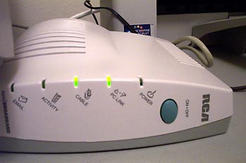
Now, this modem is on. 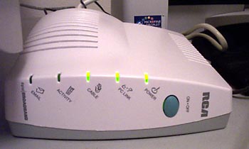
The lights do blink a lot when it's on, but that didn't help. I assumed the lights weren't blinking because something was wrong with my cable or computer. When you first plug in the power cord, the modem blinks in a subtly different way as it boots up, and it's not available then, either.
How is lighting the power light when the modem is "off" sensical? Why is the power light glowing for both "on" and "off" states? That's nonsensical.
So what precipitated the whole thing? Well, my theory is that it had to do with the sock. See, I find those blinking lights annoying and covered them with a black sock.
On a slow modem, I cared about activity because I had to. On a fast cable modem, I don't want to. I want it always on, till further notice. I must have accidentally pushed the power button through the sock.
Posted by Chad Lundgren on Friday, September 27, 2002 (Link)
(See entry on its own, including comments)
Don't link to us!
I'm such a web geek I punch in web addresses I hear on the radio. One such was the web site for an upscale dining magazine for Albuquerque and Santa Fe called La Cocinita—Spanish for "Kitchen." I wanted the "Around Albuquerque" column, which is about restaurant news.
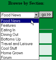 Being a web geek, I zoomed in on the dropdown menu on the the home page. I found "Food News" too abstract. I had to guess that it had "Around Albuquerque" columns in it. "Around Albuquerque" and "Santa Fe Scoop" need to be items on the menu.
But that's not even the most annoying thing. I ran into one of my pet peeves, which I've referred in the past without explaining: They made it hard to link to a specific page by using a POST rather than a GET.
You want that without technobabble? OK, here goes. There are two ways to send in the stuff in a web form after you click the submit button: A GET or a POST. (In this case, using the dropdown sends in the form.)
The POST method puts some of the stuff that should go in the link elsewhere, and a Favorite that uses a POST will either dump you on a generic page or the middle of no-where if you try to do the site the favor of revisiting. (I could explain what elsewhere is, but trust me, it won't help) Show and tell time.
Here's a POST. Notice how short it is:
![]()
In a GET, on the other hand, a full link shows up in the Address area of your browser, and if you add this Address to your Favorites, it will work.
Here's a GET. It's longer, but it takes you to the page you want: ![]()
GETs are almost always better. I'm not saying a POST should never be used: if I'm submitting credit card information, they better be using a POST for the increased security. Yes, GETs are more usable than POSTs.
Funnily enough, the link to the advertising page uses a GET.
So I cobbled together a link to the Food News page. The most current column (September) is way at the bottom. I thought January was the last time it had been updated at first, which didn't make any sense with the Radio Free Santa Fe ad I just heard. (Radio Free is, so far, still worth listening to despite having been acquired by Clear Channel. This Clear Channel link [was] another GET link I had to create by hand. (3/25/2003: Update: the link is broken, and Clear Channel is hiding their radio station stuff on their site. I have removed the links below)
The listing on Clear Channel call[ed] Radio Free "Classic Rock" on the Albuquerque listing page, but
"Adult Alternative" on the detail page. I know why it got screwed up: it's because they moved the station to 104.1, which used to be a Classic Rock station. It's a much better signal you can listen to all the way to Santa Fe and back to Albuquerque.
I would email them, but Clear Channel's contact page lists only phone and street address. Helpful.
Why do people still make it hard to link to them, when it's been known for years (scroll to number 7) this is a bad idea?
Posted by Chad Lundgren on Thursday, September 26, 2002 (Link)
(See entry on its own, including comments)
My first Usenet posting?
It's embarrassing enough. The program I was posting with to a Usenet discussion group didn't automatically word wrap. Google faithfully preserved the incredibly long third line that resulted from my failure to hit Enter at the right spots. Someone later in the thread complains about it, in fact.
Why should I have had to remember to word wrap? They'd invented word wrapping by then. Usability issue!
Here's the posting in its textual glory:
My first Usenet post in plain text format.
And here's the full thread.
I found this to show I have been on the Internet for 10 years. I was tempted to use another less embarrassing post, of nearly the same vintage, but this one, with its horizontal scrolling, shows how far back usability issues go.
Posted by Chad Lundgren on Tuesday, September 24, 2002 (Link)
(See entry on its own, including comments)
Short Term Memory
I had the impression that CompactFlash memory was much cheaper online than in the stores. With my digital camera, I needed to try it hands on, but not so for a memory card.
So I went to NewEgg.com, which is where my company bought components for my current computer for good prices. I'd already noted that NewEgg seemed a little odd on an earlier pricing expedition, but it was only as I waded in that the full gratuitous weirdness manifested.
I grumbled about registering, but I started to do so.
I received a bizarre error message:
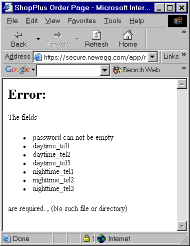
An error message with an error in it. How ironic. Not inspiring of the warm and fuzzies. But heedless, I trekked on, to figure out if the phone numbers were optional or not. (Never mind that they didn't use real English names for their form fields.)
So I'd thought the phone numbers were optional: 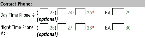
Then I wondered if it was the extension that was optional. Sure enough, as I resized my text, it made much more sense: 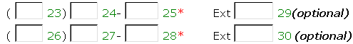
Don't word wrap! There are many ways to keep the "Optional" where it belongs.
After an incredibly looooooooong pause (granted, I'm on a 56K modem) it comes back and tells me the zip code and state don't match. I've picked New York instead of New Mexico. At least the error message is next to the error.
Then I noticed this:
Here I am, trying to buy some memory on a site that doesn't have any when it comes to my spam preferences. I don't know why that was the straw the broke the camel's back, really the error message with the error message in it should have.
I mean, how insecure and graspy does a site need to be to keep on resetting the spam preferences?
So I went to Amazon.com, assuming it would cost more. OK, it did, but by about $2. I'm not that price sensitive.
Why Amazon? It's an online name brand, of course. But what cinched it was an online memory finder. This assured me somewhat: this is the first CompactFlash I've bought, and I didn't want the wrong kind. It may be totally unnecessary, but it made me feel better.
One annoyance for both sites was my credit card. I'd just like to single out the geniuses at Wells Fargo, whose card with the stage coach background makes the letters very hard to read. Fortunately, their online banking is better.
Posted by Chad Lundgren on Saturday, September 14, 2002 (Link)
(See entry on its own, including comments)
The Semantics of Cutting and Pasting
I advocate cutting and pasting to prevent errors to my clients. However, since I do most of my editing directly in HTML, I have noticed programs do not get HTML.
What I mean by that:
If I want to move text near an end tag, most programs will grab the end angle bracket and slash: (</) as well, thus mangling at least the pasted HTML and possibly the source if I'm cutting. From my extensive testing (5 minutes in WordPad) it buys "/", "\", "-" and "_" as word boundaries, but not that opening angle bracket ("<").
(For the non technical: an HTML tag looks like this, with an opening and closing tags, with angle brackets signaling the start and end of a tag:
<p>This is a paragraph</p>
The one with the slash (/) in it is the closing tag: if this gets screwed up, weird stuff can happen. This explains why you see > crop up randomly.)
I tried to get a screen shot showing this, but the program I downloaded placed the cursor differently than I really did, so that it looked like I'd meant to select the "</" . No only that, but the program didn't load itself into memory, so when I hit the hot key of Control F5, my entry page was reloaded and blew away the first version of this entry.
I have publically dissed Dreamweaver, but when I'm editing by hand, it gets HTML. If I am inside an attribute and I double click, only the text inside the attribute gets selected. More importantly, it never tries to help, but faithfully reproduces where my mouse is in what it selects.
This lack of understanding of HTML also applies to web forms as I've noticed as I've done more web logging.
So what's the alternative, or at least an alternative?
I've heard mixed reviews on the user interface of Macintosh's latest offering, OS X, but I suspect it may handle these subtleties better than Windows.
I've always said my development platform has to have A) Photoshop and B) Dreamweaver or a decent HTML editor. With the fully "carbonized" versions of Photoshop 7 and Dreamweaver MX out, I think OS X now qualifies. I've used UNIX since my university days, so having a command line on a system with Photoshop and Dreamweaver is appealing.
Of course, my habit of accidentally pronouncing the name of the operating system "Oh Ess Eks" would probably make the other OS X geeks ostracize me.
Posted by Chad Lundgren on Tuesday, August 20, 2002 (Link)
(See entry on its own, including comments)
Web Site Woes & Asynchronous Conversations
I had to send a payment and went to the Western Union site. The Find an Agent Location page needs work. When I ran a zip code search, it insisted I pick a country, even though I'd selected the US site from a pick your country page:
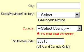
Mad, I tried 90210 as a Canadian zip:
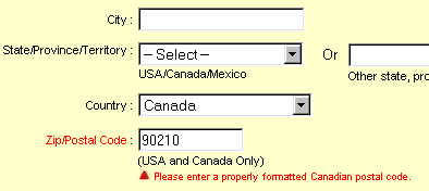
Nope, not the right format, as I had suspected. (And isn't that a snippy error message? I hate it when computers get snippy with me.)
Then I tried Mexico, even though it said "United States and Canada Only" After waiting a long time, an enormous list of what looked like every Western Union in Mexico came up. None of them have 90210 in their address.
Then, for a rousing old-fashioned finish, I received a 404 page not found error with some verbiage about my session timing out.
Getting back to the annoying search, the site knows the distinction between a United State and Canadian zip code, but fails to use it. It also makes you select United state for a search with a United States city and state.
I know New Mexico is sometimes thought to be a foreign country, but there really is only one Albuquerque, New Mexico.
Another story. I moved recently. I used the post office's online address changer on July 12th. It's August 16th. Do you think I'm getting any mail forwarded?
Even worse, while I was writing them to complain, I received a ridiculous error message about my session timing out for my privacy. I wasn't logged in with any username or personal information though, and it had not been 30 minutes.
It's almost heretical, but I often don't use the Internet to actually do something. I use it more often for information or interaction. A site has to have ease of use, a price break, a big selection, or do something I couldn't do in the "real world." This reminds me of a Jakob Nielsen column about how the Internet should be better than reality.
Web logs improve on reality in the ease of an asynchronous conversation with people from all over the world, about people, about what web sites are worth going to. For someone like me who's verbally oriented it can be compelling. I find it much more interesting than a "Just shut up and shop" (a phrase from Bruce Bethke's funny Headcrash.)
Posted by Chad Lundgren on Friday, August 16, 2002 (Link)
(See entry on its own, including comments)
Upgrading Your Friends
I upgraded some friends' computer from Netscape 4, to Netscape 6. Given all the pain Netscape 4 has caused me, I was happy to do it.
The mail import was a hassle because the Netscape people didn't make it easy to re-run the import of files from Netscape 4. Worse, the option to re-run involved adding options to a Start, Run command.
OK, survey time: how many regular users do you think add options to Start, Run? Scratch that, better question: How many regular users USE Start, Run in Windows period? Why isn't there an option to re-run the import from "Netscape 4" on the same menu that will let you import from Outlook Express and such?
But the biggest problem, because of its frequency, is the look and feel, which is silvery and odd. Even with the classic icons turned on, the mail and address book icons were pointlessly moved to the lower left side.
I considered using Netscape 6 when it came out. The deal-breaker for me was the home button, or, to be more precise, the tiny, misplaced thing they shriveled it into.
I'm a web designer. I use a custom home page as a list of pages worth checking daily and as a playground for techniques I can't or won't use on public web pages.
At this point, I'm not ruling out installing Eudora for my friends. I'll have to see how Netscape 6 works out.
Posted by Chad Lundgren on Tuesday, August 13, 2002 (Link)
(See entry on its own, including comments)
Usability applied to life
You might accuse me of being obsessed with usability. You might be right. At any rate, here are ways I apply usability heuristics to my life, most with the heuristic listed.
1. Prevent errors. I am not a morning person. If I need to take something to work, I put it in the car at night. Exception: perishable goods, such as food and videotapes, which melt or spoil in the car if I forget them. I pack lunch in the fridge the night before.
2. Prevent errors. When I bought a portable phone, I picked up many before finding an ergonomically sound and not overly expensive one. I paid special attention to the size of the talk button.
3. For a long time, I keep my wallet and keys in my back pockets. This added to pick-pocket paranoid in crowded places,and made fast food drive-thrus arduous.
I read an article mentioning that European men tend not to use their back pockets, more for vanity than practicality, but I started using my front pockets only, and I've never looked back. So to speak.
4. Consistency and standards. I always put my wallet, cash, and pen in my right pocket, and my keys in my left pocket. This way, a quick check will let me know I have them, as when I'm locking my car. Condoms, when I'm carrying them, always go in the left pocket—they are keys, from one point of view.
5. Aesthetic and minimalist design - Not only does this web site have few graphics, but I cut needless words, inspired by William Zinsser's book On Writing Well. My first draft often sounds like "It occurred to me just the other day that it might be the case that everyone is officially crazy now." when "Maybe everyone's officially crazy now." works. Clear writing helps: I often don't use the official source because its writing is bad.
6. Prevent errors. Important bills like car insurance are automatically deducted. I do not want to get into a car accident the day after my insurance expired.
7. I try to figure out how computer savvy the person I'm talking or emailing to is and adjust my jargon use, although I don't always succeed.
8. Prevent errors. (Skip if you're not a web geek) This could go under usability for programmers: I use absolute directory references when possible: "src=/images/picture.gif". That way, when I cut and paste code elsewhere on the site, the links don't break. My favorite example of how not to do it: "../../../../directory/images/picture.gif"
9. Prevent errors. (Yes, this is my favorite, what are you implying?) I always paste links to pages into email to clients, so I don't mistype one lousy character and embarrass myself. I also use makeashorterlink.com when needed.
I'd love examples of any similar rules people have. You may not have thought of these rules as usability. You might want to look at Jakob Nielsen's usability heuristics (aka rules of thumb).
Posted by Chad Lundgren on Monday, August 5, 2002 (Link)
(See entry on its own, including comments)
Search me
A client called, wanting help getting their logo on an odd operating system. So I bopped over to the IBM site to refresh my memory, and the search engine gave me fits.
IBM does do usability, but this search page needs help, because it produced this:

in response to my search. Nice error message, eh?
After some wild-goose chasing, I had an epiphany: I'd cut and pasted my search term, and sure enough, on looking at it more closely, it was "PCX ". The dreaded trailing space broke the search.
Posted by Chad Lundgren on Monday, August 5, 2002 (Link)
(See entry on its own, including comments)
Street Jogs and Kitty Corners
Donna Maurer, a fellow usability blogger in Australia, had an interesting comment on Going Postal Mapping. She liked my post but wanted to know what "jogging street" and "kitty-corner" meant. I hadn't realized these were Americanisms.
Jogging streets are streets with sections that do not intersect normally. While travelling along a street, you run into a street, turn right, go a short distance on another street, then turn left back on that first street, which still uses the same name and numbering.
Kitty (or Catty) Corner means diagonal, but is more informal; I often hear it when people describe houses in their neighborhood: My best friend's house was kitty corner from mine.
So I looked for examples of jogging streets, and discovered civil engineers call the actual intersection involved "street jogs", and ran across the Yavapai County standards for residential street jogs [Link removed 09/18/03 - no equivalent page seems to exist now. -- Chad Lundgren.] This page is a bit slow, but has good examples.
Civil engineers do not believe in my rock-chucking test, because the definitions specified minimum, not maximum distance for street jogs. Perhaps street jogs with the sideways travel distance smaller than 125 feet (38 meters) or 150 feet (46 meters) are thought to cause more accidents.
So those standards would probably disallow the Jefferson Street jog that inspired the rock-chucking rule outlined in Going Postal Mapping. It qualifies, as a thought experiment: I didn't actually chuck a rock. According to a friend, many roads in that neighborhood jog since the subdivision was laid out wrong. The section right next to Central, put in later, had to jog. Nothing like sloppy work cast in concrete.
To get back to the broader issue, it's easy to glibly say, I can write international style, I just won't use baseball metaphors. The reality, as usual, is more complicated.
Posted by Chad Lundgren on Tuesday, July 30, 2002 (Link)
(See entry on its own, including comments)
Going Postal Mapping
I moved recently and wanted to look up my local post office's phone number. I ended up at the Post Office Locator. In the midst of struggling, I received this mysterious message:
Even after clicking the "Clear This Message" button, I received the same message. The unhelpful help wrongly calls the button "CLEAR". I didn't see a home link for starting over. I had smack my Back button repeatedly to start over. I still don't know what the message meant.
The struggle was to find a particular post office on Juan Tabo. Juan Tabo (Spanish for "John Tabo") is a soulless, six-lane, major north-south, too busy for median-landscaping bastard of a street. Should be easy to find, right? Punching in my zip code, I picked a map link:
First, the "X marks the spot" icon with the word "USPS" on it sucks. From what I can tell, the address is on the second S in "USPS", NOT on the blue and white arrow. Sometimes.
Second, the words "Juan Tabo" are at the top, and the crucial "J" is cut off (circled in red). Third, too many side streets clutter the map. Fourth, and most damning: a tiny street named Paisano runs parallel to Juan Tabo; where its label sits, it makes Juan Tabo look like Paisano. (circled in red too).
On top of it all, the street name listed was Haines. Now, the only Haines I knew of was 4 miles west, so it was clearly wrong. But the post office is technically on Haines, because Haines jogs. I hate jogging streets, since before I'd even heard of usability or the web. So I'll finish with Chad's Jogging Streets Rule:
Stand on one corner of this alleged street, chuck a rock at the kitty-corner of the other section of this alleged same street. If you can hit it that corner, it is the same street. If not, it is a different street and should have a different name!
Posted by Chad Lundgren on Monday, July 29, 2002 (Link)
(See entry on its own, including comments)
Usability principles applied to programming
Usability principles I apply to programming/design:
I use the most restrictive naming conventions for everything. Essentially no characters besides letters, with case mattering. A lot of InterCapping.
Use of different variable names. I know all about scope, but I change the variable names for my benefit, not the computer's. Nested for loops using j, for instance.
I've read both CSS specs, but not recently. I don't want to waste my time on CSS vaporware: features in the spec, but that no one, not even Mozilla, implements. I generally avoid using the specs to look things up, because other sources tell you how to use it, and even more importantly, which browsers it will work in, something the W3C people don't want to sully their standard hands with.
I try to make my industrial strength passwords also relatively easy to type. I've failed more often than I've succeeded, but one thing I've learned is that capital letters in the middle of words are a sure-fire recipe (at least for me) for frustration, maybe because my brain is used to watching for two letters getting SHifted at the beginning of words but not in the middle.
Posted by Chad Lundgren on Friday, July 26, 2002 (Link)
(See entry on its own, including comments)
Usability for Programmers
There's this idea floating around that programmers, web developers, shouldn't need usability. They should be smart enough just figure it out. While it is true that programmers need to be to handle a high degree of complexity and arbitrariness, things are harder than they need to be. Regardless of any inherent complexity, well-designed tools make it easier to do the right thing than the wrong thing.
Here are some my pet peeves I've run across in my years as a Web Designer/Developer. Most will make no sense to non-technical folks:
Why is it "User-agent and not "User-Agent" for the robots.txt standard? How standard is that?
Why is it "padding-left:" in CSS and not "left-padding:"? Are we French all of sudden, putting adjectives after nouns? Why does order matter so much in shorthand shortcuts? Why is url required in @import url("/styleesheet.css"); (but not in @import "stylesheet.css"; for maximum confusion. What the hell else would I be importing, wine and cheese from the French Riviera?
Why does HTML use angle brackets? < and > are a pain to type. Square brackets would be much easier. [see?] Don't talk to me about SGML or character frequency.
Why are programming languages still being used that allow buffer overflows? This problem was solved 40 years ago. [Link to Phil Agre comment updated 03/25/2004] . All those Outlook viruses are the result.
Why are compiler/Javascript error messages so wretched? Netscape, both 4 and 6, have more specific, useful Javascript error messages than Internet Explorer, any version. This is probably the only time you'll hear me say something nice about Netscape 4.
Why doesn't command line cvs remove files for you when you issue a remove command? Talk about lazy. I've starting using WinCVS for some projects, and it does this for you. cvs in general is irritating: it has a habit of scrambling your terminal when you hit Control-C to stop an operation, forcing you to type "stty sane" or "reset" without anything being echoed.
Why aren't there standard comment characters across languages? Some programing languages use the same characters other language use for comments to actually do stuff. #, anyone?
The find command is powerful, but has odd syntax, even for a UNIX command. What genius picked a semi-colon as the terminator, so you have to backslash it? Didn't they notice it was already separating commands? I like UNIX, use it to slice and dice web server logs, but there are gratuitious complications.
I'm not optimistic about change. I am not innocent of using gratutiously complicated methods myself. Just today, a colleage wanted an image off a page that has a 0 second meta refresh tag on it. I telneted in directly to port 80, read the HTML, and contructed a path in my browser and emailed the picture off to him, showing off my ability to use raw HTTP/1.1. Then I realized the same thing could have been accomplished simply by using Internet Explorer's Ignore meta refresh tags setting.
To end on a positive note, progress is possible. The FTP default used to be ASCII and not binary. On the version of Linux I looked at, a recentish Red Hat version, it had been switched to binary.
Any other examples, good or bad?
Posted by Chad Lundgren on Friday, July 26, 2002 (Link)
(See entry on its own, including comments)
Paying (or not!) at the Pump
About 20 after midnight last Saturday, I needed gas. A lot of gas stations were dark, obviously closed. I passed two like that.
I found one with lights on, and pulled up to a pump. Its display was blank—not dark—blank. I looked at the next pump—blank too. Are they closed? Are the lights on for security? I wondered as I drove off.
Next station. The display said, One moment please. This message looked like the usual "I'm checking up on your credit card, you dog" message. Hoping it was stuck from a prior transaction, I beat the Cancel key, to no effect. I slid the card in and it talked about maintenance. Gee, thanks for that clear message there.
Third station. I hopped out, glaring at the display. It looked normal. I put my card in, backward, I realized as I did so. (Mini-rant: why in hell can't they standardize the insertion orientation?) The pump told me it was the wrong way: I re-inserted. It thought for a time, and only then, it said, Pay at the pump is not available, please pay inside.
I swore, marched in and left my credit card at the counter. As I pumped the gas, I said to a friend in the car, they're rebooting the damn computer for the accounting department. Sure enough, as I finished, the display read "Loading |". The dervish didn't even whirl, the | just sat there. (For those you wondering what I'm talking about, a whirling dervish is the old-school text version of an hourglass windows wait cursor).
How hard is this to get right? Just display the actual status when I walk up, or leave the damn lights off. Don't waste my time.
Posted by Chad Lundgren on Monday, July 22, 2002 (Link)
(See entry on its own, including comments)
Small is not beautiful on the web
Why do web sites make their text tiny? Even worse, they make it tiny with stylesheets so that the View, Text Size option in Internet Explorer doesn't work. Sites like k10k and praystation specialize in tiny text, and seduce web designers down the "small is beautiful" path to perdition. Jeffrey Zeldman influentially advocated using pixels to specify text size, because pixels are easier. He's right. It is easier: for the web designer.
What about the user? The one with bad eyesight, who doesn't know you can increase the font size in windows? I can read these tiny fonts, but I don't enjoy it. I don't like fine print on paper, why would I on a fuzzy computer screen?
While Jakob Nielsen has been rightly accused of overstatement, relatively few people disagree with the soundness of his usability heuristics (rules of thumb). User control and freedom is the one this fits under.
Here's more control: If you're using Internet Explorer 5 or higher, click on Tools, Options, the General Tab, and click on the Accessibility button. Then check "Ignore font sizes specified on web pages" and hit OK to get out. This will make Internet Explorer ignore all font sizes, and allow easier reading most of the time. The only exception is pages where the spacing between lines is set smaller, which might cause text overlap.
I complained to the ZDnet site a while back, and they stopped using pixels for regular text. I doubt I was the only person complaining, but I was glad to help.
I recommend complaining loudly to sites you feel are worth complaining to, based on their content. I don't bother complaining to sites without merit: the web is too damn big for that.
Posted by Chad Lundgren on Wednesday, July 17, 2002 (Link)
(See entry on its own, including comments)
Eudora welts
I use Eudora for email. It has some good features, but it also irritates me. Eudora often ignores Windows conventions and does its own thing.
 Like many power users, I close programs by right-clicking on the program icon on the task bar and clicking Close on that right click menu. Eudora, unlike every other program I've ever used, puts Check Mail last, rather than Close. On top of that, when I do hit close, Eudora asks me if I'm sure I want to stop checking mail. Yes!
I can hear the Eudora people saying, But... but... we have a divider between the Check Mail and Close button. Doesn't matter. I close using right click when I want to keep using the current program. This "window trimming" is an automatic behavior: my focus is on the other program.
In his great book The Humane Interface, Jef Raskin calls the part of the mind that deals with this kind of thing the "cognitive unconscious." Cognitively unconscious behaviors are habits: fast and automatic, but not flexible. Interfering with these behaviors is the single fastest way to piss a user off.
It also helps explain why many web designs fail: the designer, having consciously considered every part of the page, forgets the user will likely be scanning. Putting anything on the page that looks like an ad will get it ignored, for instance.
Getting back to Eudora, another annoyance: every now and then, it doesn't feel like letting you drag and drop messages from your Inbox to a folder. And then, just as randomly, it starts working again.
And finally, a micro-annoyance: I have a mouse with a scroll wheel. Overall, I love it, but sometimes I still use the keyboard. Internet Explorer (or maybe the keyboard ?) sometimes will not scroll when I hit the down arrow. You want talk about an automatic behavior? I've been using computers since I was 10 (and I'm turning 30 this weekend.)
For a good if not incredibly recent collection of user interfaces mistakes, many of them funny, check out the Interface Hall of Shame.
(Update: 04/18/2003: I haven't been able to reach this web site, I'm removing the link. It's too bad, I really liked it.)
Posted by Chad Lundgren on Thursday, July 11, 2002 (Link)
(See entry on its own, including comments)
To Hell with Bad Web Designers
There's this idea floating around that you can either follow web standards or you can be a degenerate Microsoft-lover and design only for Internet Explorer (IE).
That's a false choice. Clueless designers do tend to fall into the IE-only camp, but that only makes the web standards folks more infuriating: they should know better. I use web standards as much as possible, but if I need to use something one browser understands, I will as long as it doesn't screw up other browsers.
Web designers need inform their clients how their site works in different browsers. It should be in the contract, to avoid misunderstandings when the boss's cousin cruises by on his 386 with Windows 3.1 and Netscape 3.
But I don't mind sites that are less pretty but still useful in old browsers. What I do mind is telling users their browser sucks. The blurb on the A List Apart site is typical, and has inspired others: "This site will look much better in a browser that supports web standards, but it is accessible to any browser or Internet device." That's nearly as bad as "This site optimized for Internet Explorer" or the rarer "This site designed for Netscape, Microsoft sucks!!!" blurb.
Just show them the damn page already. Why insult your audience? Because you're waving a web standards banner? Do you think the user cares that you followed some amazingly boring rules about how it should work? Do you think the average user understands, other than to be insulted?
This is blaming the user re-invented. If there's one central tenet to user centered design/usability, it's not blaming the user. That's the philosophy: make the technology fit the user, not the user change to fit the technology. The browser elitism from the web standards people does not mesh with that.
Posted by Chad Lundgren on Monday, July 8, 2002 (Link)
(See entry on its own, including comments)
Female Viagra-Like Drugs Hit the G Spot
Ran across an [article on the ABC news web site that is no longer has available (Updated 03/25/2003)]. Basically, the bigger a woman's G spot, the more likely this type of drug will help her have an orgasm. My prediction: this will not solve as many of women's sexual problems as Viagra did for men, even for women with big G spots. Women are not that simple.
The original New Scientist story, complete with diagrams, assumes only women care where the G spot is, an entirely unwarranted assumption.
Posted by Chad Lundgren on Saturday, July 6, 2002 (Link)
(See entry on its own, including comments)
Non system disk error
Why in the hell, in the year 2002 AD, can we not have our Windows computers look at a floppy, boot using said floppy if it can, or ignore it and try to boot off the hard drive if it can't? Is that hard? Why does the system have to grind to a screeching halt?
Posted by Chad Lundgren on Friday, July 5, 2002 (Link)
(See entry on its own, including comments)
Distributed Spelling
I have spell checkers in all these programs:
Eudora, Internet Explorer (via ieSpell.),Microsoft Word, emacs, using ispell/aspell on several unix/linux computers and Dreamweaver
I'm sick of re-adding words to all those custom spelling word lists. I want my lists shared. A netcheck [Link removed 03/25/2004] of google found a way to synch your PocketPC and desktop PC versions of Word, but is too hard for most users. We need a web service anyone can use for all programs, and client-side programs that will go in and add the words to the right places for all those lists.
And imagine using other people's custom spelling lists, with a trust model like epinions or ebay. Selectively pick subculture word lists with words like bheer if you're into science fiction, sneakernet if you're into computers, theatre if you're into theatre.
"Theatre" is the trickiest example. Most programs don't allow taking non-preferred spellings like "theater" out of the primary list. You might get an auto-correct feature to do it, but then you have to hope auto-correct doesn't cause more problems than it solves.
The most common and straightforward case is new words. A search for "blog" on dictionary.com fails to produce a result even though the word blog has been around since 1999. A few people are already manually sharing custom spelling.
This relates to a previous posting, Google and Psychology Reality: if enough people say a word is spelled a certain way, it is spelled that way because the English language is an anarchy, and new words are constantly being invented. New bands and celebrities are always coming along. As with the spam-fighting tools that pool people's efforts and the distributed computing that fights cancer, we need to distribute custom spelling. How about an XML or .NET web service?
Posted by Chad Lundgren on Monday, July 1, 2002 (Link)
(See entry on its own, including comments)
Visualizing Social Networks
Peter Merholz (who coined the word "blog") talked about social network analysis on his site, interviewing Valdis Krebs, who talked about using social network analysis to combat terrorism.
With high hopes, I visited another site run by a different guy, www.NetVis.org, to attempt my own less ambitious social network analysis. After a struggle involving browser and Java versions, bit depths, resolutions, etc, only the demo and home page examples worked—not any of my data. The 3 public data sets I tried failed, resulting in "0" for all variables, with no coordinates for the visualizing stage to draw. It drew a little yellow dot. (See screenshot).
So I clicked on Feedback to ask what the heck was going on. It popped up a window with a form. Halfway through filling it out, it closed itself. Did the site designer mean to do that?
The site is a cool concept, but the execution frustrated me. I hope he gets it working better. I found what I believe is the designer's email address on a site he linked to, and emailed him about it.
Posted by Chad Lundgren on Friday, June 28, 2002 (Link)
(See entry on its own, including comments)
Insult Ads
So Salon.com had an article I wanted to read, but a Flash ad with Don Rickles shilling for some Vegas tie-in popped up, covering the content.
How appropriate that an insult comedian appears in this ad. I wrote Salon.com a while back complaining about this kind of ad and received a reply saying, Yahoo's doing it, the ad market's soft, we have to.
Nathan Shedroff's excellent article Computer Human Values asks "...What type of person is your interface most like? Is it helpful or boorish?" A site devoted to Rickles—The Hockey Puck—plays a sound file at you.
I'm going to start calling these obnoxious Flash ads "Insult Ads".
Posted by Chad Lundgren on Tuesday, June 25, 2002 (Link)
(See entry on its own, including comments)
A Slow Fandango
So I finally broke down and bought a ticket on Fandango.com.
It was not pleasant. First, the site is slow, and I used a high-speed connection.
I typed the movie I wanted to see tomorrow (Minority Report) and as I expected it wanted a zip code and the day. So I entered the Zip code, and picked the day with the dropdown menu. As I did so, it submitted the page, so I figured it was trying to help. Except it then asks for a zip code, which I've already entered.
Separate forms? But why have the zip code form use a Go button and the other not use a Go button if that's not the case? It should support entering data one field at a time, or both fields at once. It should never lose the zip code I just typed.
So I finally pick a showing, and then the real fun begins. I want it to remember me, but I don't want to join their marketroid "Spam me with movie news" club. So I punch everything in, with that checkbox carefully left unchecked.
There was no message at the top of the page telling me there was anything wrong. The error messages next to the fields themselves are so small I don't even see them, and assumed it was broken and resubmitted a couple of times.
Again it makes me re-enter something I'd already entered: the looong credit card number, because I'd forgotten the password.
Then I enter the password right and forget the credit card number. The password fields and error messages are below the stupid club verbiage, not below the remember me verbiage. It takes a while before I get everything squared away.
The tickets are not refundable, it turns out when I poke into the customer service area. At least the tickets are printable finally. But wait, the so-called "printer friendly" page—a separate web page—spills on to two printed pages. Come on, I've designed web pages to print to a set number of pages, it's not that hard.
This after I realize I have to switch back behind the firewall to print, and have a bad moment where I'm convinced my computer is going to crash. Fortunately, you can go back and print receipts, but that was clear to me, and Internet Explorer 6 failed miserably at saving the page.
Posted by Chad Lundgren on Saturday, June 22, 2002 (Link)
(See entry on its own, including comments)
The Usability of Curbs
When I first learned driving, what most worried me was left turns, especially in the inside lane. Why is this a problem?
Cars do not turn at 90 degree angles! Why are curbs made like this? Some curbs are good: here in Albuquerque, the left turn from San Mateo to Academy features a nice, rounded curb. Contrast this with another left from I-25 to Montgomery, where an obnoxious 90 degree curb is crumbling—from large trucks slamming into it, I like to think.
Speaking of bad road design, it's well known that bad usability kills, in this case, John Denver in the experimental plane he was flying. Just up the road from the "nice curb" on San Mateo [Link updated to Yahoo! maps 03/25/2004] the road is inclined, creating a decent optical illusion of two lanes. A large, crude-looking sign at the exit warns about the existence of three lanes. This exit is shared by a Taco Cabana and an upscale car dealership [Update: 09/18/2003: The Upscale car dealership link was removed, since it appear no longer to exist] that uses frames.
This frame usage obscures that the finance form is really submitted securely. All many users see is a warning that you're ending up on a non-secure page after having visited a secure page, people might be trying to steal your info, do you mind? This is because they are using a third party provider and the thanks page is back on the original auto dealer site.
Posted by Chad Lundgren on Thursday, June 6, 2002 (Link)
(See entry on its own, including comments)
Turd polishing
So I'm frustrated about work lately. I am the recognized usability person, but am not consulted until late in the process. My boss mentioned explaining to a client that bugs take much more to fix later in the process. I mentioned the same was true of usability.
I'm trying to get involved earlier, but the idea that a regular employee should be in charge of organizing a site isn't an idea that's bought off on. I feel like I'm doing what Scott Berkun called, in a somewhat different context, turd polishing. I can't make the changes that will actually make a difference, only try to limit the damage.
An example:
I looked at a competitor's horrible interface for an online application. The buttons had purple text with a black background. No, I'm not kidding. Even worse, though, from my point of view, was how muddy the progression from screen to screen was. There were simply too many ways of going ahead, and the meaning of the labels was unclear.
But we're being influenced by the button layout, if not the horrific button colors. I said, Hey, we aren't making the same aesthetic mistake, why should we make the usability mistakes they're making. I said, You rip off are influenced by Amazon, not those godawful home pages with the animated rainbows. So the layout was changed, I think, somewhat, but not to anything that felt anywhere close to right.
On a usability test for another site I worked on, after the usability test, I did a brief Q and A, sort of like Contextual Inquiry only not as structured, as I hadn't read that yet. The user had the completely unreasonble view that our web site should be faster than the old way of doing it which involved phone calls and postal mail.
Posted by Chad Lundgren on Wednesday, June 5, 2002 (Link)
(See entry on its own, including comments)
Faucet follies
I was the victim of the worst shower design ever this weekend while staying at a friend's house. The only visible control was on the showerhead, a knob you could turn. This knob didn't do anything. Pulling, pushing, attempting to turn, both on the knob and the showerhead itself, did nothing.
I had to break down and ask how to turn it on.
You pull down on the nozzle of the faucet. How in the world would you ever think of that? Especially when there is a knob on the side of the showerhead? The knob on the side, by the way, changed the stream from continous to pulsing.
It's similar to an example they have at baddesigns.com (a great site, by the way, it's a great deal of fun to browse). I would have sent them a really bad example of the credit card machine they use at a supermarket here in Albuquerque, but I couldn't get a good picture of it before I was nearly thrown out by a manager type.
Posted by Chad Lundgren on Tuesday, May 28, 2002 (Link)
(See entry on its own, including comments)
Second Usability Rant
CSS needs better usability. Since when does the adjective come after the noun? I am speaking, of course, of my desire to say things like "left-padding: 2 em;". No, I don't expect this to change.
I am more happy with the look and feel now, but will probably continue futzing. I'm still trying to figure out why I like the orange/purple color scheme so much.
Posted by Chad Lundgren on Friday, May 10, 2002 (Link)
(See entry on its own, including comments)
Most Popular
- Seattle Sunset background image
- Usability applied to life
- Is "My Bad" Bad?
- Free Password Previewing Tool version 2.3 (146 Kb)
- Sunset in New Mexico background picture
- Bath and Body Works
- Atkins.com: Lose the Table Fat
General
Other Web Logs
Categories
- Adminstrative: 11 entries
- General: 51 entries
- Personal: 2 entries
- Photography: 13 entries
- Poetry: 8 entries
- Usability: 71 entries
Archives
- October 2006
- February 2006
- July 2005
- June 2005
- March 2005
- December 2004
- September 2004
- August 2004
- July 2004
- June 2004
- May 2004
- March 2004
- February 2004
- January 2004
- December 2003
- November 2003
- October 2003
- September 2003
- August 2003
- July 2003
- June 2003
- May 2003
- April 2003
- March 2003
- February 2003
- January 2003
- December 2002
- November 2002
- October 2002
- September 2002
- August 2002
- July 2002
- June 2002
- May 2002

Unless otherwise expressly stated, all work on this site including photos, poems, and web logs entries are licensed under a Creative Commons License.