Fighting with a web page
The subtitle: Use your Javascript powers for good, not for evil!
So I'm about to upgrade my computer, and I was out pricing parts. I encountered an incredibly annoying feature at Dealtime.com that seemed designed to irritate me. [03/24/2004 - Link removed - search
is completely different]
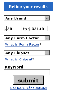 I wanted to blank out the prices to indicate I didn't care, for the moment, about the price, but wanted to focus on other criteria. But the page helpfully used Javascript to substitute some values, presumably defaults for "everything."
Why not just leave the form fields blank?
Posted by Chad Lundgren on Thursday, October 31, 2002 (Link)
(See entry on its own, including comments)
Password Usability & Typability
I have a lot of sites that need passwords. I've tried a number of different methods for making secure but easy to remember and type passwords.
One thing that bothered me is that it's a lot different typing when you only see a bunch of ******'s show up. So I've set up a previewing page you can save to your computer and use to test how easy it is to type a password.
I strongly recommend you save the page to your hard drive before you use it. I ended up running a usability test on myself: I managed to mistype my new password twice, so now I've modified the page so that you entered the prospective new password twice.
There is a tension between usability and security. Nowhere is that more obvious than with passwords. System administrators want their users to use passwords like "WeRQ#$^zfbr" and users want to use "bob". I believe it's possible to find a reasonable compromise between both.
Here is my list of DOs and DON'TS to picking a password:
- DO NOT use an entire real word, English or foreign, for a password. Keep in mind some systems will not even allow part of the password to be a real word.
- DO NOT use login names, birthdays, social security numbers, names, favorite fantasy characters: pretty much anything that is easily guessable.
- DO NOT use capital letters in the middle of a word. This is hard to type accurately.
- DO NOT use two letters repeated. It's easy to type two "tt"s wrong. Avoid repeating letters at all, in fact. "enterer" is a pain to type accurately.
- DO NOT use spaces, and don't start with a number; some systems cannot handle them.
- DO NOT use the common recommendation of taking a phrase like "I went to the store and brought some bread." and converting it to "Iwttsabsb" This will tend to produce hard to type passwords.
- DO NOT use any part of an old password. It's a bad idea, and some systems will not allow it.
- DO NOT change your passwords right before a weekend or before you go on vacation!
- DO use a number, a capital letter, or a symbol like "%". Some systems require one, or even two of each.
- DO make up words that are easy to say and type. A good starting place is fantasy name generators [Third link removed because it crashes Mozilla/Firefox every time with some COM/ASP junk --03/28/2004], but always change some of the letters. If you make the word too easy, you may be hitting a foreign word by accident: I recommend always putting at least one number, letter, or capital in somewhere.
- DO use a different, "throwaway" password for sites (often newspaper ones) like the New York Times that need it. This is an easy password you can reuse for sites where the worst that can happen is that someone pretends to be you reading the New York Times.
A more subtle point for people who type faster: keep in mind there are certain typos that happen because the wrong pattern is faster. This is one reason "teh" happens: the "t" and "e" are on the same row, but the "h" is on the right hand. Try to pick patterns that work with rather than against this tendency. (Anyone suggesting "typewriter" as a password will be smacked.) I generally find letters flowing from left to right more conducive. Some bottom row letters can give me fits at times.
Finally, have fun. A password that means something to you will be easier to remember.
Posted by Chad Lundgren on Saturday, October 26, 2002 (Link)
(See entry on its own, including comments)
Balloon Fiesta Pictures
The Albuquerque International Balloon Fiesta happened earlier this month. Here are pictures. The haiku is a bit harder to find.


Posted by Chad Lundgren on Wednesday, October 23, 2002 (Link)
(See entry on its own, including comments)
Never stop thinking
Michael Wong thinks users can't handle navigational links anywhere but on the left side of the page:
"If you tried to buck this convention by placing the main navigational links anywhere else, it could easily confuse most users." Use Standard
Conventions
It will not surprise you to learn that I disagree. This is too simplistic. Most novice users I've seen in usability tests ignore the top and sidebars and concentrate on the first headline, scrolling down to the bottom and possibly use the text links. Then and only then do they go to the sidebar.
When I think how many web designers spend hours debating navbars and then say, oh, here's where the content goes, I wince because I used to be the same way. Design the content too!
But even saying that navbars are not as important as you think is not enough: I would qualify this by saying the users were in a "search" mode: trying to find a specific piece of information. I don't see why this would change when users are in casual use mode, but I try to avoid broad strokes unless I'm doing it for humorous effects or doing an elevator pitch on usability.
This bothers me so much because it reminds me of when I first got into usability so long ago. Usability rules of thumb should be used a starting point for thinking, not the ending point. Beginners find broad proclamations tempting, but they are the primrose path to perdition (except for this one). To paraphrase a teacher from college "Never stop thinking. Never!"
I also believe but have no actual evidence to support the view that while graphically, having a different colored navigation bar, on the left or right sides makes sense, it discourages people from reading the sidebar as much, to the extent they do, by making it too easy to focus on just the middle of the page. My gut feeling is, white space works better.
Jared Spool has done actual research. He tested the importance of page layout to ecommerce success. The key quote:
"The sites that ignored the 'expected placement' of elements sold just as much product as those that matched it precisely."
Posted by Chad Lundgren on Friday, October 18, 2002 (Link)
(See entry on its own, including comments)
Underlined text that's not a link
Most people consider underlining text that's not a link a usability gaffe, but Warrior Librarian Weekly makes good use of the disconnect you feel when you move your mouse over what you think is a link but then realize is not. It works partially because she has a hover over the real links, and because the fake links look like this:
...There is no more to read >>
It mocks the convention of using "More..." or "More to read..." and then cheerfully goes on to use it on the same page.
Since I'm usually violently allergic to underlined text, disliking it even in print media, this is an accomplishment. The site also has some funny fake error messages.
Posted by Chad Lundgren on Friday, October 18, 2002 (Link)
(See entry on its own, including comments)
Discussion-worthy
Is it silly to say "I've been on the Internet for 10 years"? I have, it turns out.
John Rhodes [Link removed 03/25/2004 since it's gone] thinks so. He did clarify in a lengthy comment a ways down that he felt that if you view the Internet as a utility, like water or cable TV, it's silly to brag about how long you've been using it. I would agree.
But I fall under the participatory view as well as the geeky "using Internet protocols" view. I have UseNet postings from January of 1992. I participated in the UseNet discussion groups for years until they were ruined by spam. I actually answer question in technical mailing lists as well as reading the lists, and have for years. I'm still not jaded about the Internet after all these years.
Or, to put it another way, I always add both "In bed" and "On the Internet" to my fortune cookies.
Posted by Chad Lundgren on Wednesday, October 16, 2002 (Link)
(See entry on its own, including comments)
Read-worthy book
In usability primarily because I don't have an information architecture section. That may change after I read the book by
Christina Wodtke, who runs the eleganthack.com web log, has a book that is being published called Information Architecture: Blueprints for the Web. Amazon claims it's being published today, October 16th, 2002.
My goal is to use worthy as a suffix for 3 postings in a row. Wish me luck.
Posted by Chad Lundgren on Wednesday, October 16, 2002 (Link)
(See entry on its own, including comments)
Linkworthy
A good article about online retail (aka etailing) search engine usability
"Ivy-covered halls are filling up again with eager students of the user experience fields ready to change the world (or at least to study out the recession). But are these programs really teaching them what they need to know?" (Boxes and Arrows)
Posted by Chad Lundgren on Wednesday, October 16, 2002 (Link)
(See entry on its own, including comments)
Learned Helplessness
My Windows 98 computer had a totally generic icon in place of the usual "My Computer" icon for a year or two. I thought I'd done something bizarre to it, and assumed it would be a royal pain to fix, involving registry hacks and the like.
So I downloaded the Windows Power Tools, even though they're supposedly only for Windows 95, and they didn't do what I wanted. So I poked around a bit more and discovered on the Screen control panel, there is an Effects tab. I'd only used it to turn on font smoothing, as I recall, and that was where you changed the icon. Not hard at all.
A trivial instance to be sure, but this brings up learned helplessness. You learn that you can't do something, and if you believe you can't, well then, you can't. It's completely different from not knowing whether you can or not, which allows you to find out.
The canonical example is elephants. According to the possibly apocryphal story, young elephants are chained up with strong iron shackles. They learn that they can't be broken, and by the time they're an adult, a simple rope restrains a grown elephant that could easily snap the rope from trying to get away because they know it can't be done.
While the elephant story verges dangerously close to an inspirational poster, I've found it a useful metaphor. There have been a number of things in my life that I have been convinced I could not do. Once I was able to move myself to the "Well, I may not be good at it, but I may be able to do it" frame of mind, progress usually followed. Examples include losing 100 pounds, dating, and, more recently, cooking. (Although I still maintain that forgetting aluminum foil was pretty funny.)
Many people have developed learned helplessness toward computers. Otherwise competent people suddenly say, "Oh, I don't know a thing about those computers." The very smart Phil Agre pointed out that the way computer users blame themselves for computer problems bears a disturbing resemblance to the way victims of domestic violence tend to blame themselves (usually with the help of the abuser) for the violence.
This applies to technical and usability difficulties. If I just weren't such an idiot, I wouldn't get hit with the blue screen of death. If I weren't such a space case, I wouldn't lose that email I'd been writing for an hour.
As in life in general, it's hard to break out of a cycle of learned helplessness when it comes to computers. Some time back Phil Agre wrote a great article called How to help someone use a computer that provides excellent advice for experienced computer users when they help less experienced users. I make it a point to go back and re-read it from time to time. I don't think the summary on his main page where he links to the article—"help helping people use computers without oppressing them"—overstates the case.
Posted by Chad Lundgren on Wednesday, October 16, 2002 (Link)
(See entry on its own, including comments)
Zen Haiku Upgraded
I'm now using Movable Type 2.5. What does that mean?
I have turned on the search. It's available over on the right sidebar. Feedback welcome. I plan to take a look at the comments search next.
Automatic trackbacking [Link to Joshua Kaufman's site removed, since he's apparently into the whole 410 thing now 03/25/2004] is turned on, which is great because I think it will get a lot more use when people don't have to go out of their way to do it. It automatically sees if it can ping any of the sites that are linked to.
Posted by Chad Lundgren on Friday, October 11, 2002 (Link)
(See entry on its own, including comments)
Usability applied to your sex life
Here's some increased usability I'd like to get my hands on :
A condom applicator invented in South Africa that makes it take about 5 seconds to put a condom on.
Even better, it solves one of my pet peeves, that of the condom trying to unroll upside down. According to the page about the Design Award it won:
"Its textured surface enables a person to apply the condom with the correct side up—even in complete darkness. "
As I tell people I'm giving the elevator pitch on usability to, if there's something you keep on saying, I can never remember how to do that right, that's a sign of bad usability.
The design firm's site itself is OK, although I wonder how long the condom applicator content will stay on the firm profile page I've linked to. Update (3/25/2003: I was right: I've updated the link). Worse, the animation showing it in action on a test, err, cylinder, is a big old animated gif. (309Kb)
Posted by Chad Lundgren on Thursday, October 10, 2002 (Link)
(See entry on its own, including comments)
Usability is job 1. Or not.
This amused me while I was poking around the UNM job web site:
"This is a description of a staff Job at UNM, NOT a Job Opening Announcement. Look for Current Job Openings and then Apply Online or use UNM's Staff JobFinder to be notified of vacancies for jobs of interest to you. "
What? Why would I want to look at job descriptions for jobs that are not open? As far as I can tell, this whole site exists just to to email you when openings are available.
More seriously, why did I get to a detailed results page before realizing the ejobs thing was not what I was looking for, which was actual job openings?
The main employment page at UNM has the font size fixed used pixels so that you can't resize it in IE5-6 using the usual View, Text Size command that a few more users at least know about. Can you say federally funded sites need to be accessible? I knew you could.
[Updated 03/25/04: The link on the "main employment page" went away. The new page, site really, the Human Resources site, still does not have resizable text.
Posted by Chad Lundgren on Sunday, October 6, 2002 (Link)
(See entry on its own, including comments)
Clay Shirky on Web Logs and Publishing
As usual, Clay Shirky has an interesting point to make:
"Rather than spawning a million micro-publishing empires, weblogs are becoming a vast and diffuse cocktail party, where most address not "the masses" but a small circle of readers, usually friends and colleagues. This is mass amateurization, and it points to a world where participating in the conversation is its own reward."
Although a goal of Zen Haiku is to have more edited writing than your average web log, this doesn't change the point. The poetry entries have comments from my friend Roslee, and the usability entries have comments from usability colleagues such as Joshua Kaufmann and Lyle Kantrovich.
I find it ironic in light of all the people who have been fired for their web logs, that in virtually every email cover letter I've sent out with my resume, I've referred to my web log, often with a link to my Usability Applied to Life column. [Link removed to diveintomark site 03/25/2004]
I've always generally avoided personal stuff. Not for job reasons, but just because I don't feel comfortable talking about personal issues in front of the world. It's like being at a cocktail party, to use Shirky's metaphor, and suddenly you're hearing about someone's embarrassing medical problem: it's a case of TMI (Too Much Information). TMI, once you explain it, is a usefully short interjection to interupt somebody with.
Posted by Chad Lundgren on Thursday, October 3, 2002 (Link)
(See entry on its own, including comments)
Sexy Contacts and Googlefighting
A few diversions:
This article about contacts making you sexier makes me wonder. The students were taken to London nightclubs with "strict instructions to go and 'pull'." I assume 'pull' is British English for "mack" or "hit on" or "put the moves on" or whatnot. It rings a bit oddly in my ears.
How long have I been wearing contacts? That's what I thought. This is news? Next you're going to be telling me the whole blonds are dying out news story is fake. (update: Link changed 04/18/2003).
In a completely unrelated story, Googlefighting. Find out which keyword has the most results on on Google. My best: women versus men. Women edged men out by a narrow margin, with 49,500,000 results versus men's 49,100,000 results (As of October 2, 2002).
Maybe that is related somehow.
Posted by Chad Lundgren on Wednesday, October 2, 2002 (Link)
(See entry on its own, including comments)
Most Popular
- Seattle Sunset background image
- Usability applied to life
- Is "My Bad" Bad?
- Free Password Previewing Tool version 2.3 (146 Kb)
- Sunset in New Mexico background picture
- Bath and Body Works
- Atkins.com: Lose the Table Fat
General
Other Web Logs
Categories
- Adminstrative: 11 entries
- General: 51 entries
- Personal: 2 entries
- Photography: 13 entries
- Poetry: 8 entries
- Usability: 71 entries
Archives
- October 2006
- February 2006
- July 2005
- June 2005
- March 2005
- December 2004
- September 2004
- August 2004
- July 2004
- June 2004
- May 2004
- March 2004
- February 2004
- January 2004
- December 2003
- November 2003
- October 2003
- September 2003
- August 2003
- July 2003
- June 2003
- May 2003
- April 2003
- March 2003
- February 2003
- January 2003
- December 2002
- November 2002
- October 2002
- September 2002
- August 2002
- July 2002
- June 2002
- May 2002

Unless otherwise expressly stated, all work on this site including photos, poems, and web logs entries are licensed under a Creative Commons License.