Mildly Disturbing Radio Commercials
Two examples:
1) There's a commercial for Dickey's that has women singing in a come-hither manner to illustrate how good their barbeque is. I don't put much faith in pop psychology, but this "Food is love" marketing, conflating food with sex, bothers me.
2)There's a commercial for St. Vincent's Hospital in Santa Fe that includes "We've cured your abuelo's cancer and cast your daughter's arm." (Abuelo is Spanish for grandfather)
The second half of the sentence bothers me. Why are they throwing arms around? Why are they deaf to linguistic nuance?
Posted by Chad Lundgren on Monday, August 26, 2002 (Link)
(See entry on its own, including comments)
The Semantics of Cutting and Pasting
I advocate cutting and pasting to prevent errors to my clients. However, since I do most of my editing directly in HTML, I have noticed programs do not get HTML.
What I mean by that:
If I want to move text near an end tag, most programs will grab the end angle bracket and slash: (</) as well, thus mangling at least the pasted HTML and possibly the source if I'm cutting. From my extensive testing (5 minutes in WordPad) it buys "/", "\", "-" and "_" as word boundaries, but not that opening angle bracket ("<").
(For the non technical: an HTML tag looks like this, with an opening and closing tags, with angle brackets signaling the start and end of a tag:
<p>This is a paragraph</p>
The one with the slash (/) in it is the closing tag: if this gets screwed up, weird stuff can happen. This explains why you see > crop up randomly.)
I tried to get a screen shot showing this, but the program I downloaded placed the cursor differently than I really did, so that it looked like I'd meant to select the "</" . No only that, but the program didn't load itself into memory, so when I hit the hot key of Control F5, my entry page was reloaded and blew away the first version of this entry.
I have publically dissed Dreamweaver, but when I'm editing by hand, it gets HTML. If I am inside an attribute and I double click, only the text inside the attribute gets selected. More importantly, it never tries to help, but faithfully reproduces where my mouse is in what it selects.
This lack of understanding of HTML also applies to web forms as I've noticed as I've done more web logging.
So what's the alternative, or at least an alternative?
I've heard mixed reviews on the user interface of Macintosh's latest offering, OS X, but I suspect it may handle these subtleties better than Windows.
I've always said my development platform has to have A) Photoshop and B) Dreamweaver or a decent HTML editor. With the fully "carbonized" versions of Photoshop 7 and Dreamweaver MX out, I think OS X now qualifies. I've used UNIX since my university days, so having a command line on a system with Photoshop and Dreamweaver is appealing.
Of course, my habit of accidentally pronouncing the name of the operating system "Oh Ess Eks" would probably make the other OS X geeks ostracize me.
Posted by Chad Lundgren on Tuesday, August 20, 2002 (Link)
(See entry on its own, including comments)
Putting your faith in firewalls
I ran across a great article (via Tomalak's Realm) by Simson Garfinkel about how firewalls promote the illusion of security while simultaneously 1) still allowing mischief and 2) blocking legitimate uses. He doesn't advocate getting rid of them, but points out that internal users and internal desktops are how most viruses and information loss occurs. The article has a good non-technical explanation of what firewalls are.
Since I'm on record as hating firewalls because of reason 2), it's good to see other people pointing out the limitations of firewalls.
Posted by Chad Lundgren on Saturday, August 17, 2002 (Link)
(See entry on its own, including comments)
Web Site Woes & Asynchronous Conversations
I had to send a payment and went to the Western Union site. The Find an Agent Location page needs work. When I ran a zip code search, it insisted I pick a country, even though I'd selected the US site from a pick your country page:
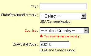
Mad, I tried 90210 as a Canadian zip:
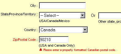
Nope, not the right format, as I had suspected. (And isn't that a snippy error message? I hate it when computers get snippy with me.)
Then I tried Mexico, even though it said "United States and Canada Only" After waiting a long time, an enormous list of what looked like every Western Union in Mexico came up. None of them have 90210 in their address.
Then, for a rousing old-fashioned finish, I received a 404 page not found error with some verbiage about my session timing out.
Getting back to the annoying search, the site knows the distinction between a United State and Canadian zip code, but fails to use it. It also makes you select United state for a search with a United States city and state.
I know New Mexico is sometimes thought to be a foreign country, but there really is only one Albuquerque, New Mexico.
Another story. I moved recently. I used the post office's online address changer on July 12th. It's August 16th. Do you think I'm getting any mail forwarded?
Even worse, while I was writing them to complain, I received a ridiculous error message about my session timing out for my privacy. I wasn't logged in with any username or personal information though, and it had not been 30 minutes.
It's almost heretical, but I often don't use the Internet to actually do something. I use it more often for information or interaction. A site has to have ease of use, a price break, a big selection, or do something I couldn't do in the "real world." This reminds me of a Jakob Nielsen column about how the Internet should be better than reality.
Web logs improve on reality in the ease of an asynchronous conversation with people from all over the world, about people, about what web sites are worth going to. For someone like me who's verbally oriented it can be compelling. I find it much more interesting than a "Just shut up and shop" (a phrase from Bruce Bethke's funny Headcrash.)
Posted by Chad Lundgren on Friday, August 16, 2002 (Link)
(See entry on its own, including comments)
Design change
I've changed the background of the top area. I wanted it more zen, and more Albuquerquean. Or New Mexican. And less gradial.
Oh, and before I hear from a web geek smart ass, the "http//:" in the graphic is intentional. It emphasizes how usability was not designed into the web initially. The idea came from a picture of a sign at a trade show.
Heck, I used to find "http://" hard to say. Now I just reel it off my tongue like it's poetry. We should hold a competition to see how many times web geeks can say "H - T - T - P - COLON - SLASH - SLASH" in five seconds. I'd be a contender, I'm telling you.
Posted by Chad Lundgren on Wednesday, August 14, 2002 (Link)
(See entry on its own, including comments)
Upgrading Your Friends
I upgraded some friends' computer from Netscape 4, to Netscape 6. Given all the pain Netscape 4 has caused me, I was happy to do it.
The mail import was a hassle because the Netscape people didn't make it easy to re-run the import of files from Netscape 4. Worse, the option to re-run involved adding options to a Start, Run command.
OK, survey time: how many regular users do you think add options to Start, Run? Scratch that, better question: How many regular users USE Start, Run in Windows period? Why isn't there an option to re-run the import from "Netscape 4" on the same menu that will let you import from Outlook Express and such?
But the biggest problem, because of its frequency, is the look and feel, which is silvery and odd. Even with the classic icons turned on, the mail and address book icons were pointlessly moved to the lower left side.
I considered using Netscape 6 when it came out. The deal-breaker for me was the home button, or, to be more precise, the tiny, misplaced thing they shriveled it into.
I'm a web designer. I use a custom home page as a list of pages worth checking daily and as a playground for techniques I can't or won't use on public web pages.
At this point, I'm not ruling out installing Eudora for my friends. I'll have to see how Netscape 6 works out.
Posted by Chad Lundgren on Tuesday, August 13, 2002 (Link)
(See entry on its own, including comments)
Usability applied to life
You might accuse me of being obsessed with usability. You might be right. At any rate, here are ways I apply usability heuristics to my life, most with the heuristic listed.
1. Prevent errors. I am not a morning person. If I need to take something to work, I put it in the car at night. Exception: perishable goods, such as food and videotapes, which melt or spoil in the car if I forget them. I pack lunch in the fridge the night before.
2. Prevent errors. When I bought a portable phone, I picked up many before finding an ergonomically sound and not overly expensive one. I paid special attention to the size of the talk button.
3. For a long time, I keep my wallet and keys in my back pockets. This added to pick-pocket paranoid in crowded places,and made fast food drive-thrus arduous.
I read an article mentioning that European men tend not to use their back pockets, more for vanity than practicality, but I started using my front pockets only, and I've never looked back. So to speak.
4. Consistency and standards. I always put my wallet, cash, and pen in my right pocket, and my keys in my left pocket. This way, a quick check will let me know I have them, as when I'm locking my car. Condoms, when I'm carrying them, always go in the left pocket—they are keys, from one point of view.
5. Aesthetic and minimalist design - Not only does this web site have few graphics, but I cut needless words, inspired by William Zinsser's book On Writing Well. My first draft often sounds like "It occurred to me just the other day that it might be the case that everyone is officially crazy now." when "Maybe everyone's officially crazy now." works. Clear writing helps: I often don't use the official source because its writing is bad.
6. Prevent errors. Important bills like car insurance are automatically deducted. I do not want to get into a car accident the day after my insurance expired.
7. I try to figure out how computer savvy the person I'm talking or emailing to is and adjust my jargon use, although I don't always succeed.
8. Prevent errors. (Skip if you're not a web geek) This could go under usability for programmers: I use absolute directory references when possible: "src=/images/picture.gif". That way, when I cut and paste code elsewhere on the site, the links don't break. My favorite example of how not to do it: "../../../../directory/images/picture.gif"
9. Prevent errors. (Yes, this is my favorite, what are you implying?) I always paste links to pages into email to clients, so I don't mistype one lousy character and embarrass myself. I also use makeashorterlink.com when needed.
I'd love examples of any similar rules people have. You may not have thought of these rules as usability. You might want to look at Jakob Nielsen's usability heuristics (aka rules of thumb).
Posted by Chad Lundgren on Monday, August 5, 2002 (Link)
(See entry on its own, including comments)
Search me
A client called, wanting help getting their logo on an odd operating system. So I bopped over to the IBM site to refresh my memory, and the search engine gave me fits.
IBM does do usability, but this search page needs help, because it produced this:

in response to my search. Nice error message, eh?
After some wild-goose chasing, I had an epiphany: I'd cut and pasted my search term, and sure enough, on looking at it more closely, it was "PCX ". The dreaded trailing space broke the search.
Posted by Chad Lundgren on Monday, August 5, 2002 (Link)
(See entry on its own, including comments)
Comment URLs clickable
I've ranted about sites showing but not linking URLs, and I was not having URLs auto-linked on Zen Haiku.
Now they are.
Posted by Chad Lundgren on Thursday, August 1, 2002 (Link)
(See entry on its own, including comments)
Most Popular
- Seattle Sunset background image
- Usability applied to life
- Is "My Bad" Bad?
- Free Password Previewing Tool version 2.3 (146 Kb)
- Sunset in New Mexico background picture
- Bath and Body Works
- Atkins.com: Lose the Table Fat
General
Other Web Logs
Categories
- Adminstrative: 11 entries
- General: 51 entries
- Personal: 2 entries
- Photography: 13 entries
- Poetry: 8 entries
- Usability: 71 entries
Archives
- October 2006
- February 2006
- July 2005
- June 2005
- March 2005
- December 2004
- September 2004
- August 2004
- July 2004
- June 2004
- May 2004
- March 2004
- February 2004
- January 2004
- December 2003
- November 2003
- October 2003
- September 2003
- August 2003
- July 2003
- June 2003
- May 2003
- April 2003
- March 2003
- February 2003
- January 2003
- December 2002
- November 2002
- October 2002
- September 2002
- August 2002
- July 2002
- June 2002
- May 2002

Unless otherwise expressly stated, all work on this site including photos, poems, and web logs entries are licensed under a Creative Commons License.